
The Paragon shopping experience
The story of how I designed the information architecture for a new e-commerce site for Paragon Sporting Goods Company.
an overview
For my second UX project at General Assembly, I was assigned to design an information architecture for Paragon Sporting Goods Company in less than 12 days. I was given profiles for three personas, i.e. targeted users, to guide the overall design and 90 products to categorize within the site’s new architecture.
Given those prerequisites, here’s an overview of my research process on this project:
- Brand analysis: Who is Paragon? What is their brand? What are their business goals?
Business & competitive analysis: Who are Paragon’s competitors? What are their strengths, weaknesses, opportunities, threats? What is the market for sporting goods sales online?
Heuristic analysis: How do their sites compare? How would one of our targeted users discover products, checkout or register for an account? How many clicks does it take for the user to reach their goal?
Contextual inquiry: Upon a visit to Paragon, I observe how shoppers shop. What are their shoppers’ pain points? What are their behaviors in the context of shopping within the store?
Card sorting: How do users find what they’re looking for? What taxonomies are the most intuitive?
After the research is completed, my design and testing process included:
- Site mapping: I built a skeleton of the site in OmniGraffle not just from results from the card sorting, but from findings from my research overall.
Sketching and Wireframing: I drafted and wireframed my ideas of how the information architecture will look on the site page by page, first on paper, then built out in Sketch.
Prototyping: With my primary persona’s hypothetical task in mind, I built a working medium-fidelity prototype using my wireframes in InVision.
Usability Testing: I asked users in tests for their initial impressions of what they were seeing and gave them a scenario of what they would be looking for on the site. Insights from these users would lead to
Second Iteration: Fresh insights from the usability testing would lead to a fresh round of edits on the prototype. If given enough time, the cycle of testing and iterations would be ideal to improve the user experience.
kickoff
Before the project began, I was provided with profiles on three personas: Dexter, Edda and John. As I poured over the details of their needs, favored brands and purchase cycles, I synthesized and distilled how these users’ were alike and how they were different.

“It’s not whether I can afford it, it’s whether I can afford NOT to have it!”
— Dexter
For the ever-hip 29-year-old scriptwriter Dexter, it is about convenience, digital competence and the savvy of your brand voice. His profile reads:
- “Dexter likes to cook and entertain with friends, and is a big fan of ‘retro-chic.’ Since he does not yet have a family of his own, he only buys gifts for his friends and relatives over the holidays. He considers himself a digital native and a smart consumer. He loves to share unique New York City culture with people “back home,” and show off his purchases. As a writer, he has a keen eye for sharp copy and likes brands who express their personality through their words.”
To fulfill Dexter’s needs, the site would need authoritative, comprehensive details and reviews on all the products, a great selection, a quick checkout and shipping process, and all of it, available at his fingertips on his iPhone.

“He tells me what he wants — the hard part is finding it.”
— Edda
Accessible and attentive customer service is the biggest factor for Edda, a 61-year-old grandmother. Her profile reads:
- “Edda is the grandmother of a 9-year-old boy and a 6-year-old girl. As her grandchildren grow and develop, each holiday sees her buying the next best thing, which must be appropriate for their age and experience. Edda buys online less often than in-store, but she understands that it’s the best way to get specialist products, and appreciates the convenience of home delivery. She usually places online orders after browsing in-store and comparing prices from several sources.”
Edda doesn’t keep up with trends like Dexter, so she her needs are greater during her long purchase cycle. She relies on trusted recommendations and suggestions based on her purchase history to filter out the overwhelming number of choices on display. She prizes expertise. For her, quality customer service needs to be a click away.

“I need something that [my daughter and I] can do together.”
— John
For John, a 38-year-old schoolteacher, it is about finding his favorite brands at the best possible price. His profile reads:
- “John is the single parent of a 12 year-old girl. He struggles to find the right gifts for her as her interests change regularly, and he tends to steer her toward activities he can also take part in. He is a little cost-conscious and wants cool stuff at a fair price. As an art teacher, he cares about design and is critical and vocal about brands which don’t meet his high expectations. The brands he likes reflect his tastes and behavior. He often finds what we wants first and then figures out where to buy it, rather than shopping from the same sources every time.”
John and Dexter share a consciousness for cool brands that fit their tastes, but John will wait it out on a purchase until the price is right. Like Dexter, he values selection, but doesn’t have as much confidence as Dexter that what he’s buying is the best option. He relies on reviews and recommendations to reassure him that he’s making the right decision. He’s also somewhat skeptical of e-retailers. It’s on them to prove to him he’s buying from a trusted business.
But beyond their specific needs and pain points, what they all had in common was something everyone wants in a shopping experience: To accomplish their goals easily.
I would have to consider the pain points of all three of these targeted users as I journeyed through the project and researched and designed the information architecture for the site. I would eventually choose one of the them as a primary inspiration to tell the story of how someone would use it.
Along with the personas, I was given 90 products from within Paragon’s catalog to include within the information architecture of the site. These would be vital later in the process as part of a series of card sorts with users. I would eventually need to include at least another 10 products, for a total of 100. More on the criteria of how I chose the additional 10 products later.
brand analysis
I’d never been to Paragon’s store at 867 Broadway, so this was a great opportunity to learn about a brand with fresh eyes. First, I went to their current site to discover what Paragon is all about. I also read up on profiles of Paragon from local media organizations, such as New York Magazine, and customer reviews on Google. I had to remind myself that my goal was not to redesign Paragon’s current site, but to imagine the client is in need of their first e-commerce site.

Outside Paragon Sporting Good Company at 867 Broadway in New York City. Photo Courtesy of Paragon Sporting Goods Company.
Paragon literally means “model of excellence.” Below is how Paragon describes themselves on their site:
- “One Store. Since 1908.
For sports enthusiasts around the world, Paragon Sports is considered the benchmark of quality for all types of sports equipment and clothing. Privately owned since 1908, we have taken pride in showcasing products from the brands you know and love as well as unique and exceptional brands that you may not be familiar with yet.
You will find everything you need (and more) in a unique “Specialty Shop” environment within our huge single store located at 18th Street and Broadway in New York City.
At Paragon Sports, we are committed to bringing you the most innovative and technologically advanced products in the sports and outdoor field. It is our mission to provide a unique and fulfilling shopping experience to every customer, every time, by setting the standard in customer service and quality product.
We thank you for visiting and hope you have a very pleasant shopping experience both online and in our store!”
As far as the brand, according to the customer, here’s a snapshot of some of the reviews on Google, where Paragon currently has a 3.6 out of 5 out of 250 reviews. Not scientific or quantitatively deep, but it offers a quick glimpse of customer satisfaction.

These were my three initial takeaways about the brand from my research:
- Massive selection of high-quality brands and products.
- They’re the experts — dependable, knowledgeable and trusted.
- An established New York mom-and-pop institution since 1908.
Business and Competitive Analysis
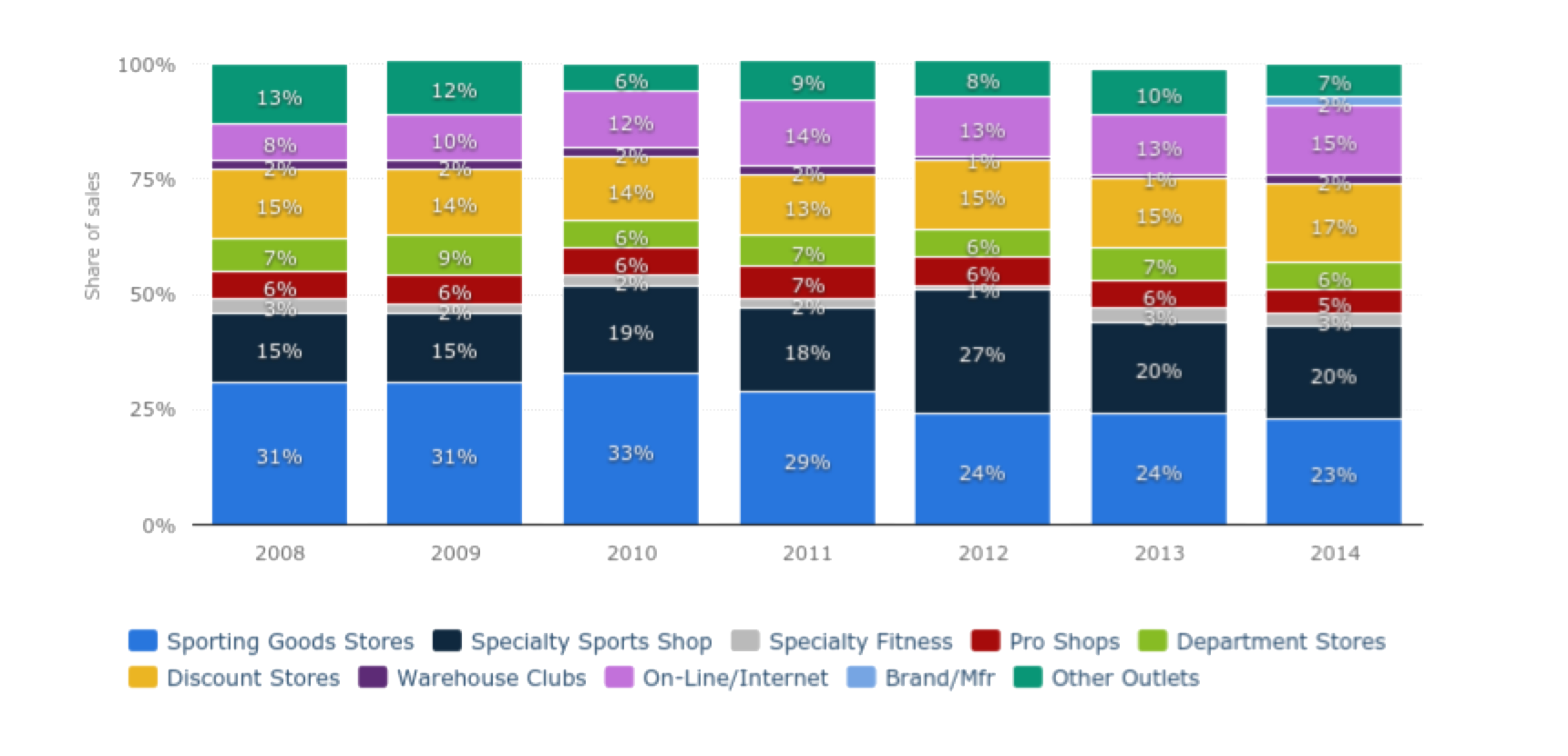
Once I understood Paragon’s brand, I began to analyze the sporting goods landscape. I found a lot of data on sporting goods sales online, some of it surprising from several online sources. One of the biggest surprises I found: In 2014, more than 76 percent of sporting goods were purchased in brick-and-mortar locations. Only about 15 percent was bought directly online. Of the 15 percent, most were shopping through their mobile device. Those numbers surprised me. What was different about sporting goods that consumers were more likely to buy them in a store than online? I thought there was an opportunity to not only explore the “why” but also the how. How can Paragon transcend the data and become a uniquely user-centered experience?
Through my research, I discovered more than 50 different potential competitors. Most of these competitors fit into separate subcategories: Specialty, discount, online, manufacturer. I thought I was going to have to draw a competitive analysis for Amazon.
But given the market data, my assumptions about Amazon as a competitive seller of sporting goods was not valid, neither were the product manufacturers who sold their own merchandise, such as Reebok, Burton, Nike or New Balance. Required expertise might be behind the rejection of Amazon as an option for sporting goods purchases, as selection might be reason behind the low percentage of sales at brand-specific retailers.
An investing report on Forbes.com, titled "How Dick's manages to fight off Amazon," also put to rest my initial assumptions of Amazon’s domination across all retail sectors.
Filtering out competitors based on all the market and investment data, three competitors stood out. Since Paragon has only one store, I searched the city for specialty sporting goods stores closest to Paragon that offer similar products and selection. REI was the closest.
Defining the competition

REI is the first competitor I analyzed that fit into a similar mold as Paragon. They sell a similar selection of high-quality brands. They have a higher customer value ranking of 4.2 out of 5 on Google from a comparable number of users. They can compete against Paragon on customer service and expertise. They are an institution, founded in 1938 in Seattle, who’ve been expanding nationwide. They also clearly speak to their audience of adventurists through their content and product classifications, or taxonomies.
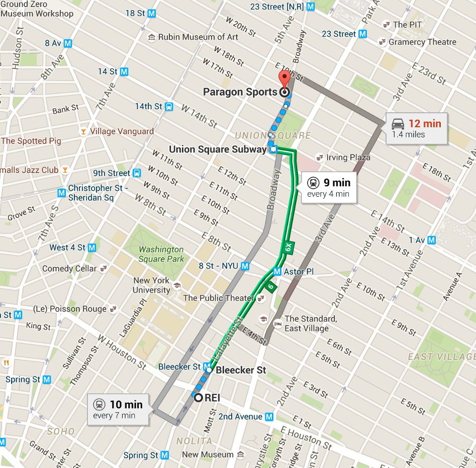
The distance between Paragon’s store at Broadway and 18th Street and REI’s Houston Street location is 9 minutes by mass transit.
Dick’s Sporting Goods was the next competitor that rose to the top. Their customer base seeks quality brands at a great price, and because of that, they are the largest specialty sporting goods retailer by sales in the U.S. They are second only to Walmart as the biggest overall seller, about $9.3 billion, in sporting goods merchandise. Founded in 1948, Dick’s has a brick-and-mortar footprint in only one borough of New York City, Staten Island, and New Jersey, but given their ability to sell sporting goods at competitive prices, I saw a threat.
Modell’s Sporting Goods was the third prime competitor I chose, but not before considering Sports Authority. According to the New York Business Journal in February 2016:
- “Sports Authority, which just filed for Chapter 11 bankruptcy protection and plans to sell or close 140 stores over the next three months, may be providing a new opportunity for its New York City-based rival Modell’s.”
Modell’s and Dick’s are said to be beneficiaries in market share from the restructuring deal. Modell’s, founded in 1889, has the largest footprint of sporting goods stores in New York City. Their customer base is broader, less specialty and more casual, and sales of fan products, such as team apparel and memorabilia, are a big segment of their business.
Comparative Analysis and User Flows
The next day, I performed a heuristic analysis on the user flows of REI, Dick’s and Modell’s’ sites, comparing under a set of criteria how the user moves through the site from product discovery to checkout. Putting myself in the user’s shoes, I used Abby Covert’s heuristics to frame the analysis.
Covert’s nine criteria — findable, accessible, clear, communicative, useful, credible, controllable, valuable, learnable and delightful — was used to dissect each competitor’s user flow. Questions such as “Is it easy to recount?,” “Can it be grasped quickly?,” “Can a user easily describe the value?” were among 45 questions. When each was answered to the best of my evaluation, I rated each answer on a scale of 1 to 5 — 1, failing to exhibit professional execution; 3, meeting expectations; and 5, exceeding expectations.
Comparing the navigation
This is where the journey would begin as a user. For each site, I attempted to find an item as my main persona. In some cases, the information archtecture would slow me down and make the experience less rewarding. The checkout process would be another user flow I would test.
After the heuristic analysis was complete, REI scored the highest, with a 3.45. Dick’s was second with 2.76 and Modell’s was third, with 2.26. If I had the time, I would’ve also gone back and counted the number of clicks it took to go from product discovery to checkout.
REI’s was the best by far, overall:
- Help, product returns and customer service is highly visible and accessible.
- The navigation was intuitive, but not consistent. The categories are labeled by activity first, but then switches to gender, and then “More.” There’s also categories “New Arrivals” and “Deals.” Their analytics must tell them that their target users come to the site often and need to know what’s new quickly.
- Messaging of guarantees, i.e. “The REI difference,” offers reassurance that I’m making a good purchase with them.
- Results pages offer user with expert help on how to buy specific products. Reinforces their expertise and my investment with the company.
As far as my experience with Modell’s and Dick’s Sporting Goods:
- Modell’s main navigation is less consistent, and in some cases, way too general. “Sporting Goods” as a category? I’m on a sporting goods website. Be more specific. We also bounce between category by type, then by major leagues, i.e. “MLB,” “NBA,” etc. So, their user base must spend a lot on team apparel, or they have partnerships with major league organizations. If I’m not in the market for team apparel, then I feel as though this might not be the place to shop.
- Dick’s main navigation is more consistent in their categories than Modell’s. It’s split by “Team Sports” and “Exercise,” then “Footwear” and “Apparel,” then “Golf” and “Outdoor,” two categories that must be big business for the brand. It’s more appealing to a general audience in search of sporting goods, and they deal with the Modell’s problem of categorizing team apparel by putting it under one category: “Fan Shop.” This is more successful.
- Help was less present on Dick’s Sporting Goods’ site, only in main navigation in the form of a small “Live Chat” feature. On Modell’s’ site, it’s also hidden, but at least it’s in the global navigation, i.e. the footer at the bottom of the page, and more robust in depth.
REI Product Discovery and Checkout User Flow
So, in my first user flow, John wants to buy a bike for his daughter so they can go on a ride together this summer. Instead of using the search function to find a bike, John clicks through the main navigation to find a bike. Search should be a last resort for your target users. In most cases, your information architecture should be the go-to resource for about 80 percent of your total users. If it isn’t, either you’re an Amazon, with a product list that makes navigation too labyrinthine, or your IA is not intuitive enough.
Dick’s Product Discovery and Checkout User Flow
So, in my second user flow, John wants to accomplish the same task. However, in the process of checking out, it’s not clear why Dick’s requires new and returning customers to complete their delivery information. It simplifies the flow, but at the expense of a returning customer’s user experience.
Modell’s Product Discovery and Checkout User Flow
So, in my third and final user flow, John again goes through the process of buying a bike. The main difference in the process is the main navigation. Beyond finding a product, the experience of checkout is not much is different from REI. I argue that REI’s category labels are more intuitive in my heuristic analysis.
Contextual Inquiry
Filtering out competitors based on all the market and investment data, three competitors stood out. Since Paragon has only one store, I searched the city for specialty sporting goods stores closest to Paragon that offer similar products and selection.
On Wednesday night, March 30th, I spent 2 hours inside Paragon’s store at 18th and Broadway. It was my first time in the store. I was there to perform a contextual inquiry — mainly to observe shoppers and their behaviors, but also how the store is departmentalized and how shoppers navigate the space.
The navigational signage at the main floor staircase.
A display of running shoes outside of Paragon Sporting Goods Company in Union Square.
As I approached the main entrance on Broadway, I was dazzled by the window displays of running shoes. The entrance-exit doors were small, and as I entered, I saw a security station nearby with a guard behind it. To my right was a checkout station with a line of customers hugged around it in a bottleneck. Past the checkout, to the right and near the main staircase, was navigational signage. On it were options by category and arrows to direct customers to go up or down the stairs. Each floor and department was very well-staffed with customer service representatives. I was approached more than 4 to 5 times by customer service.
Once I was able to navigate the cavernous floors, I mostly observed in several key departments how shoppers shopped. I wanted to know how they found products, how they navigated through the store, how they sought out help, what they did before they made a purchase, how they tested products and more.
I immediately noticed a pattern of behaviors as I walked around the store taking notes and pictures:
- Users love to try out their products. Whether it was jackets, shoes, backpacks, bikes or helmets, customers spent a lot of time examining and testing a product before making a judgment on whether or not to buy it. One shopper spread a bunch of backpacks on the floor to try out each one individually.
- In a couple of cases, customers spent a good 15 to 20 minutes trying out a product and carrying it around the store before eventually putting it back on the shelf and walking out empty-handed. One customer would pick up an item before dropping it to pick up a different item and repeated the process through several more items.
- In two cases, customers were told an item was not in their size or style and would have to special order, which for one exasperated customer, would take more than a month to ship.
- One woman came in specifically to talk to a service rep about which type of backpack to buy for a month-long European trip. The customer service specialist was attentive and knowledgeable.
- In the cycling department, a woman was buying a bike, the $400 Linus Rambler. The customer service specialist had brought it out of the stockroom for her. Her husband, meanwhile, peppered the customer service specialist with questions about performance, accessories, warranties and more. When it comes to specifics, sometimes it's helpful to have an advocate who can help you make the right purchase.
The tag on one of the jackets a customer tried on before buying.
One of the jackets that was tried on by a customer.
A customer inside the "Backpacks & Sleeping Bags" area of the store.
Trying on backpacks was very common among all the customers in the department.
A customer tries on a backpack.
A customer inspects a bike. When it comes to sporting goods, users need to try out the products and be highly reassured they are the right products to purchase for them.
Another customer tests the backpacks.
With inspiration from my three given personas and purchases made in the store, I came up with 10 additional products for a total of 100.
Below are the 10 products I added to the list and why:
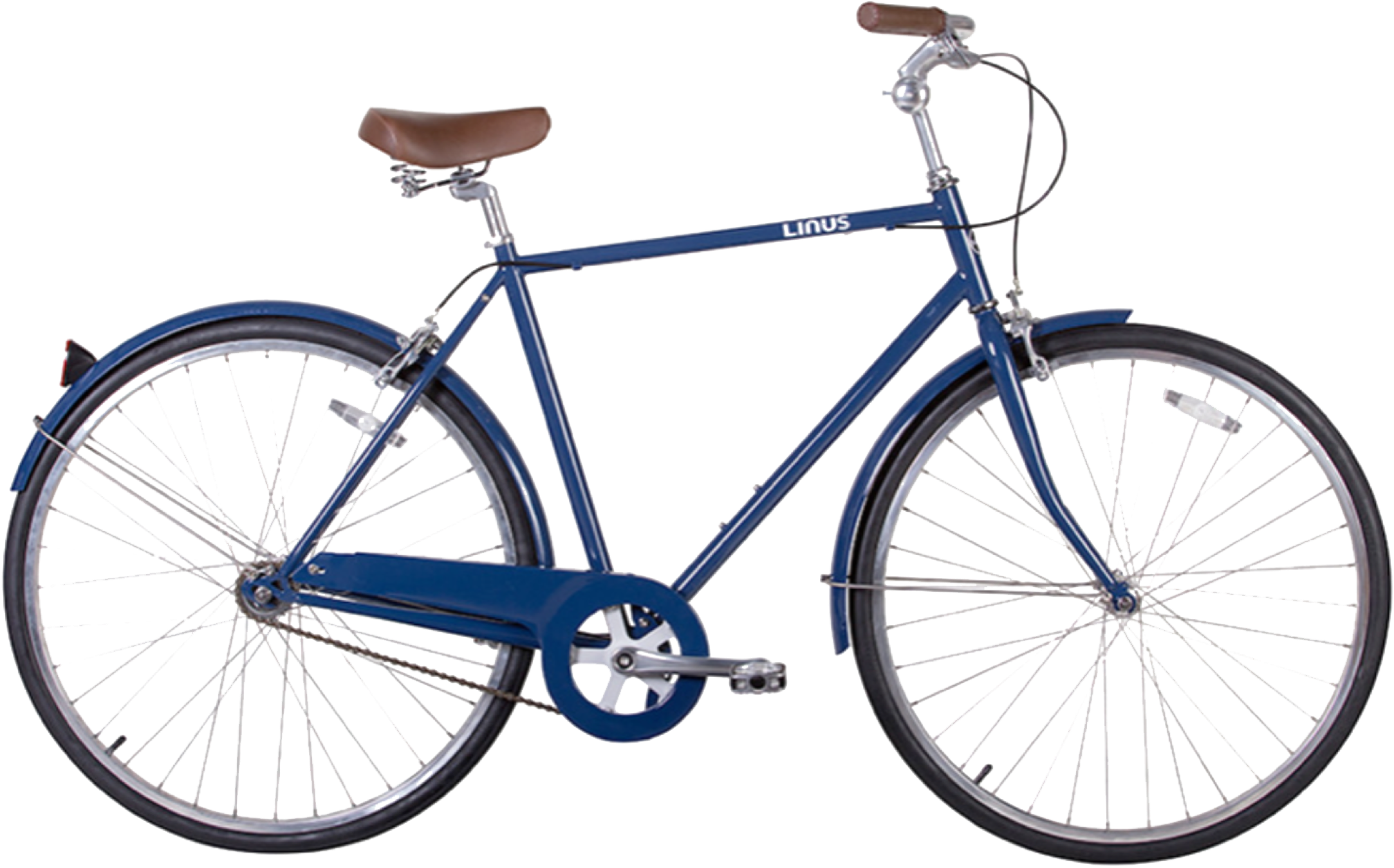
The Linus Rambler Bike
This product I chose because it was one of the more pivotal purchases I observed in the store, and also because John, one of my targeted users, might have a need to buy this for an adventure with his daughter.

Thermos Vacuum-Insulated 10-Ounce Food Jar
This is one of the products I saw purchased quickly during my contextual inquiry, but was also a camping accessory John would buy for a trip with his daughter.
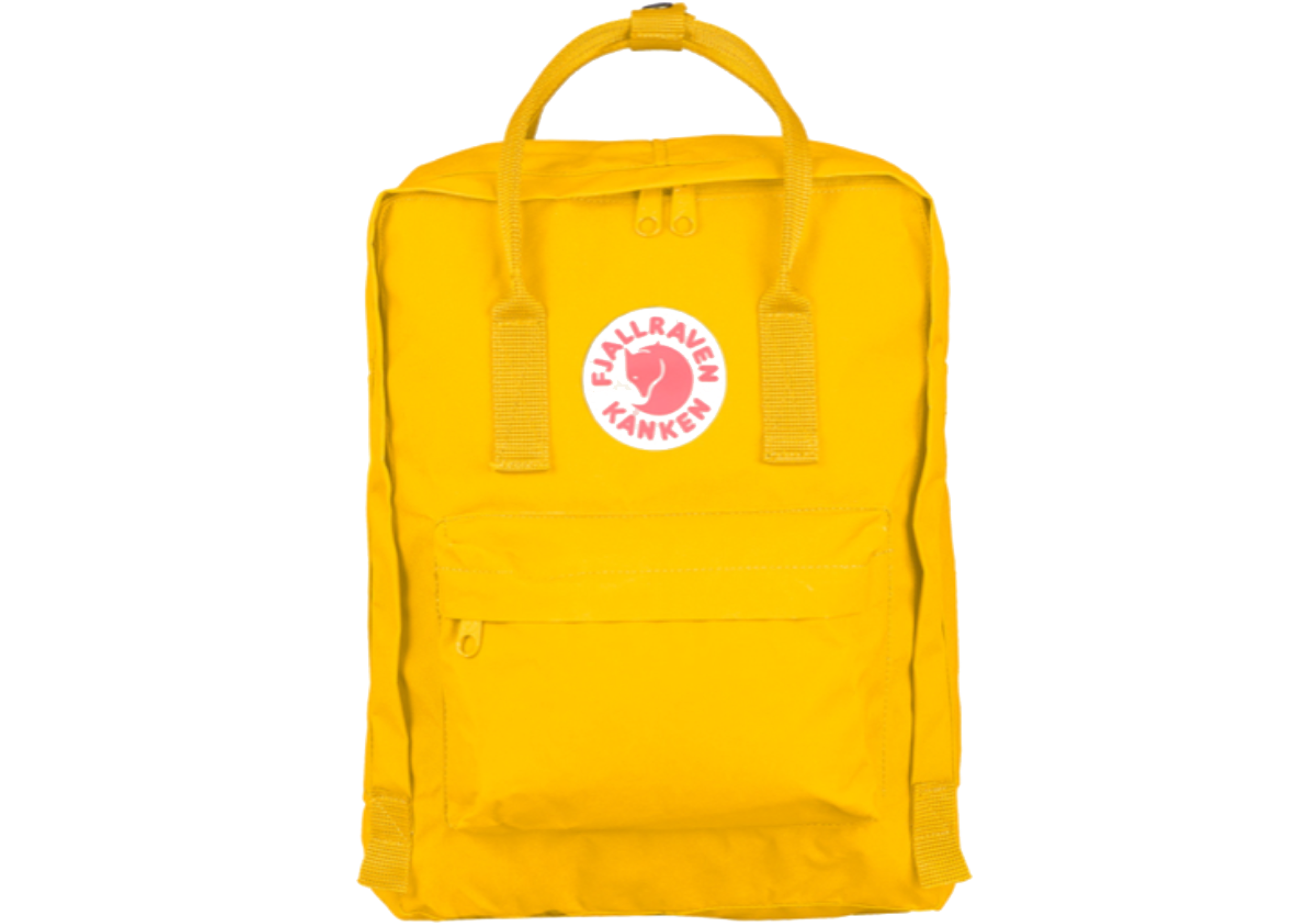
Fjallraven Kids’ Kanken Bag
Very trendy brand and style of backpack I could see Dexter buying for one of his nieces for Christmas or Edda buying one for her granddaughter.

Osprey Talon 22 Backpack
This was a product that was tested on the floor by a couple of different shoppers during the contextual inquiry. One carried it around the store putting it back on the shelf.
The last 6 items
Perfect Pushup Elite (A), Klean Kanteen Classic Stainless Steel Bottle with Sport Cap (B), Sugoi Men’s Evolution Bike Shorts (C), Marmot Black PreClip Jacket (D), Nike Men’s Low Quarter Dri-Fit Socks (E), and Adidas Men’s Aeroknit T-Shirt (F). These products I saw being purchased during my contextual inquiry.
Card Sorting
With 100 products now available to choose from, I began the process of card sorting. I printed out images of all the products, cut them out and began to sort them on my own. I would eventually do 8 card sorts, 6 open and 2 closed, with 3 total users, including myself.
Cutting out a sampling of products for card sorting.
At the end of the first card sorting session I ended up with two main categories: “Apparel” and “Equipment & Gear.”
For the first card sorting session, not being a shopper of sporting goods myself, I thought it was a good exercise to begin with my own open card sort. It took me more than an hour to sort all the items into their respective categories and subcategories. It wasn’t as easy as I assumed it would be. I took notes on my results, feeling unsure whether my classifications would be intuitive to another user. Some items baffled me. For example, I had to search for information in what sport you might use “an arm warmer.”
In my initial sort, I only had two categories: “Apparel” and “Equipment & Gear.” Subcategories for “Apparel” were split by gender, then type of apparel, then activity. For “Equipment & Gear,” it was subcategorized by activity. I had duplicated gender-neutral items across “Men” and “Women” subcategories.
The second card sorting session. The pile on the right was a mystery pile until late in the card sort. It became a main category for “Recreational Sports.”
The next day, I did another open card sort, but with a new user, Ray. The initial sort by category took him 15 minutes. A further sort by subcategory took another 30–45 minutes. The results were similar with my sort, but diverted in other categories, too.
In the final sort for the second user, there were six main categories: “Apparel,” “Exercise,” “Camping,” “Footwear,” “Cycling” and “?,” which I would eventually label as “Recreational Sports.” Within some of those categories, such as “Camping,” “Cycling” and “Recreational Sports,” there were no subcategories. In “Footwear,” it was separated by gender, then brand. For “Apparel,” items were subcategorized by type, then by gender. For “Exercise,” it was by activity or type.
This sort gave me a few insights, despite the inconsistency in the categorization labels:
- For starters, “Footwear” was broken out from “Apparel.” I prompted the user to explain why. He thought that it was a distinct category that would frustrate him if it was buried in another category.
- He had put all backpacks and bags into “Apparel,” which I had also done in my open sort.
- He had subcategorized “Apparel” first by type then by gender because of the number of gender-neutral items, such as hats, socks and other accessories. Some accessories, such as hats and backpacks, also found their way into categories classified by activity.
In the third cart sorting session, two open sorts and 2 closed sorts were done. Accessories were not easy to classify in the closed card sort.
For a third card sorting session that night, I had a new user, Roxy, conduct an open card sort with the 100 items. She sorted the products into four categories: “Clothing,” “Footwear,” “Bags and Backpacks” and “Gear.” On the next open sort, she subcategorized “Clothing” and “Footwear” by gender, then type. “Gear” and “Bags & Backpacks” was filtered by activity or type. This took her about an hour.
The first immediate insight was that this user also had “Footwear” in a separate category. I asked why. “When you need a pair of shoes, it’s something you shop for with purpose,” she said. Because there are so many choices of shoes, if you don’t have a “Footwear” category out front, I might assume you don’t sell them.
Other insights:
- “Bags & Backpacks” were put into a separate category, but because of the low number of items in the category, I wondered if they could be subcategorized under a main category. She said it would make more sense to categorize them under “Gear” than “Clothing” because “you don’t really wear a backpack as much as you might use one.”
- She added a category of “Travel” and “Tools” under “Gear,” as well as “Accessories” under “Clothing” for gender-neutral items. Why “Travel” and “Tools,” I asked, and not “Camping?” Her response: “I don’t like camping.” Essentially she’s saying I would find these elsewhere because you wouldn’t catch me in the “Camping” department.
Since I had some time left with Roxy, I decided to do a closed sort with her, using Ray’s taxonomies. First, I had her do a closed sort with the main categories, then another with the subcategories. One observation made immediately clear after she was done: “Bags,” one of Ray’s categories under “Apparel,” was empty in the closed sort because Roxy didn’t think to categorize bags and backpacks under “Apparel.” Ultimately, that was proven not to be intuitive.
The more card sorting I did, the more patterns I could find in how users classify products. However, none of the users sorted the items by brand, which I would need to do for my target users. I know that two of my targeted users, Dexter and John, shop by brand, and one, John, also shops by price. I would need to accommodate this in the information architecture, either in the global navigation or custom elements.
Analyzing the Results
With the data and insights I got from research and card sorting, I developed my taxonomies for Paragon’s new e-commerce site so that they were as intuitive to the target user as possible:
Primary product categories: Three total, “Apparel,” “Footwear” and “Equipment & Gear.”
Secondary product categories: In “Apparel” and “Footwear,” by gender, then by type of clothing/activity. In “Equipment & Gear,” by activity or type.
Duplicate product subcategories: Gender-neutral apparel such as hats, gloves and socks would fill a subcategory of “Accessories” under “Apparel.” Socks would also be available in an “Accessories” category under “Footwear.”
Appealing to our target users: Based on research and targeted users pain points, I would make “Help” and “Sale” primary categories in the global navigation. Shopping by brand I would build into the local faceted navigation and as a custom element on the homepage.
Sitemapping
Using OmniGraffle, I built a hierarchical map of how the navigation would be structured. This would be the bones of the site, so it was important that, based on the results of my card sorting and research, the site map flow and that the taxonomies be scalable into the future.
The site map I designed for Paragon Sporting Goods Company’s E-commerce site, based on card sorting and research.
Sketching and Wireframing
Once I had a clean, easy-to-follow site map, I began the process of ideating and sketching in low-to-medium fidelity. I began with the global navigation, sketching layouts, scaling text and call-to-action buttons. I then began to draw entire page template layouts for the homepage, a product landing page, a product page, a cart page and multiple checkout pages, including for registration, shipping, payment, review and confirmation.
All of these pages included sketching common navigational elements, such as breadcrumb and local faceted navigation, as well as custom elements, such as review forms, product details, photos, and more. In the process, I was always thinking about contrast, repetition, alignment and proximity of elements on the pages.

An initial sketch for the global navigation header.
Early sketches for the product landing, cart, account creation and detail pages.
First and higher-fidelity in-progress sketches of the checkout process.
A closeup of a medium-fidelity sketch of a product page.
I took my drawn sketches and vectored together medium-fidelity versions in Sketch. Being an expert Adobe InDesign user, I really enjoyed using Sketch for the first time. I found the interface, as well as the shortcuts, quite intuitive.
Building a medium-fidelity wireframe in Sketch.
Building in medium-fidelity would allow users in tests to focus more on the functionality of the design and not be distracted by color, typography and photography.
Prototyping
After I had designed all my pages in Sketch, I began the prototyping process in InVision. I would soon be bouncing back and forth between InVision and Sketch to fulfill unforeseen requirements of my flow — dropdowns and key microinteractions, such as review text fields. I also went back to Sketch to create near-duplicate versions of pages to allow the interactions for testing to work properly. InVision took a little more time to learn some shortcuts, but it was very responsive to my needs.
A first prototype built using InVision.
Product landing pages built in InVision. This shows how the local navigation can filter the items by category.
The product page for the bike includes details and specs, reviews, buying tips and recommendations.
The cart page displays the item and a checkout call-to-action.
the checkout process
The next four pages, from top to bottom, show the checkout process. First an address confirmation and shipping page, a payment page, review page and confirmation page.
First step: Shipping.
Second step: Payment.
Third step: Review.
Fourth and final step: Confirmation.
A quick checkout page for those with Paragon user accounts and a purchase history.
A form for new account sign-up.
Top navigation includes “Apparel” dropdown.
Top navigation includes “Footwear” dropdown.
Top navigation includes “Equipment & Gear” dropdown.
Top navigation includes “Help” dropdown.
The global navigation includes a footer with “Help” repeated along the top.
From left, the “Added to Your Cart” prompt when an item is added to the cart. At right, dropdown options for “Color” and “Speed” for the bike product page.
Usability Testing
Once I had a working prototype, I went downstairs to General Assembly’s Product Management Immersive (PMI) class to grab some users to help test.
The first usability test.
My first user test was with an avid runner, Nathan, who doesn’t usually buy sporting goods online, unless he knows exactly what he’s buying. He said, “I not only need to know if a shoe will fit, but will it perform.” Because he has one foot that’s slightly larger than another, he needs a greater access to the product before he buys. He also is brand-conscious, and tends to buy the same product over and over again if it meets his needs. He was familiar with Paragon’s brand.
His first impressions of the homepage of the prototype were:
- Very clear categorization and navigation. Very scannable.
- “Search” not clear just based on the icon.
- Help in global navigation is highly visible, accessible and useful.
- Clean, uncluttered homepage keeps focus on the goal.
After his initial impressions, I gave him a scenario: Imagine you are going on a bike ride this summer. You are using the site to find a bike that fits your needs and proceed to buy it. Observations from this exercise included:
Homepage: Navigates to category “Equipment & Gear,” then “Cycling” in the global navigation header. But if he wasn’t sure of the subcategory, he would like to click “Equipment & Gear,” and have it take him to a category landing page. However, in this case, it was clear to him to click “Cycling.”
Product Landing Page: Was fairly indifferent to the offer of help on how to purchase a bike in the call-to-action at the top of the page. He found filtering products within the faceted navigation helpful, as well as sorting products by price.
Product Page: He went to the reviews first, then wondered what “Tips” meant in the product menu. Then after noticing that the “Quantity” was already filled out for “1,” proceeded to click “Add to Cart” to add the bike to the cart, but was told he needed to fill out the color and size of bike in the selection fields. He responded positively to the reminder. He clicked “Add to Cart” again and was prompted with feedback to his latest cart addition with an option to “Checkout,” which he did.
Checkout Process: This tripped him up in the beginning, as the first page in the checkout had his address already activated as a return user, but included a whole other set of fields to add another address. A “Submit” button below the fields also threw off his checkout flow. It confused him. He breezed through the payment page, but on the review page, he was concerned there was no feedback on when he might receive the bike before he clicked “Place Order.” On the confirmation page, he was pleasantly surprised by the feedback telling him when his bike would arrive and the opportunity to share news of his purchase on social media. This addition was inspired by Dexter. He did say that featuring more related products or offering registration at the end of the sale might be useful.
The second usability test.
Asking questions during my second usability test.
My second usability test was with Isaac, who shops sporting goods by brand, recommendation or price. Site recommendations, such as “Others also purchased” don’t motivate him. “Sales help motivate me to buy,” he said.
His first impressions of the homepage:
- He thought the categories in the navigation were clear.
- He finds easy, repeated access to customer service and returns, highly visible in top navigation and footer, to be appropriately “helpful.”
After his initial impressions, I gave him the same scenario as Nathan. Key observations from this usability test included:
Local navigation: He thought the local navigation on the product landing page needed more filters based on brand, price and features. He liked the ability to compare products.
Product photos: He would like to be able to zoom into the product photos, which he couldn’t in the prototype.
User reviews: He would like more context as to who is writing the reviews. “Are they people who purchased the bike from Paragon?,” he asked.
Tips: Like Nathan, Isaac liked the idea of getting expert tips from customer service specialists on the site, but said the labeling of the feature was too vague.
Technical jargon: When deciding what speed of bike to purchase, between a 21-, 24- or 27-speed bike, he was puzzled. “I wouldn’t know what a good size is,” he said. He thought there could be an easier way for the casual shopper to find the right “size,” or rather speed, of bike.
Checkout: Like Nathan, Isaac was also confused by the additional address form on the first page of checkout, especially since as a “repeat customer,” his address information is already a selection.
Confirmation: He thought, like Nathan, it would be nice on the confirmation page to have an incentive to keep shopping or to buy something on your next visit
While I had time, I asked Isaac to go back to the homepage and register as a new user. When he did, a pop-up prompted him to fill out profile information. Two fields stood out to him — phone number and middle initial. “Do you really need that? What would you need my phone number for?”
Second Iteration
After the usability testing, I set out to improve several issues:
- Both Isaac and Nathan said the first page of the checkout was clunky. Requesting a new address, even though, the user’s is already built into the checkout as a selection confuses.
- Make the custom element on the homepage be filtered more by the specific users recent brand purchases. This made me think about the addition of “Brands” to the top navigation, but I think a filter in the local navigation might be as useful without the extra category.
- Make the search option on the homepage more clear.
- Allow users to zoom into product pictures.
- Add recommendations to the confirmation page.
- Add more filters into the local navigation on the product landing page.
Upon completing the first iteration of Paragon’s discover to checkout flow, I created a user flow for John, my primary persona. For John, who could be a returning customer, a shorter checkout flow was created to expedite his process.
the final user flow
The final user flow for the new site includes a Quick Checkout for returning customers. The darker route denotes a happy flow from discovery to checkout.
Based on the insights from user testing, I designed a second iteration of the wireframes for additional testing. But because time was limited, I chose to only make changes that were high-priority and low-effort. These included making search more visible and adding more categories to the faceted navigation on the product landing page. The content of those categories, and any remaining changes I would leave for my next steps.
What I Learned and Next Steps
What I learned in this project is that information architecture is vital. No matter how well all the other aspects of the product are designed, IA can make or break the experience. It’s the foundation. I also learned the value of taxonomies, labels, breadcrumb navigation and designing with user’s expectations in mind, such as where user’s expect the shopping cart icon to be in the global navigation, or why search should be a last resort when designing for your target users.
I also learned how important personas, archetypes forged from our user research data, are in informing our decisions throughout the process and how useful user flows and site maps are in communicating the overall IA strategy to other designers and developers.
As the project came down to the wire, I spent less time on sketching to have a first iteration prototype ready to test. During user testing, I found out that missing microinteractions in my checkout flow and common filters in my faceted navigation — not being able to sort by price, brand, etc. — were highly noticeable and took emphasis away from some of the aspects of the prototype on which I would’ve sought more feedback. I think further sketching and wireframing would’ve filled those gaps earlier.
Beyond what I learned throughout this project, my next steps would be:
- Adding “Brands” to the top navigation. This would allow Dexter and John, who are brand-conscious, to be able to browse through brands quickly without using search.
- Bringing more familiarity to the placement of receipt information throughout the checkout process. I thought putting the information closer to the call-to-action buttons (“Next” or “Place Order”) would be more intuitive, but it’s not where users are used to seeing it. So if I have any needless variations in how users go through the checkout process, I would revert to common memory models.
- I would continue to iterate my design and user test the prototype as the process demands before moving up to a high-fidelity mockup.
This project was strenuous, but rewarding. I learned to use many essential UX tools — contextual inquiry, heuristic analysis, personas, card sorting, user flows, site maps — and software — OmniGraffle, Sketch and InVision — for the first time. After 12 days, I had developed a robust UX arsenal, which I would be able to carry with me into all my future projects.