
print portfolio
the redesign of the republican
In 2014, I redesigned The Republican, a daily newspaper in Springfield, Massachusetts, in less than 3 months. The new design was part of a massive digital-to-print restructuring of the production of the newspaper, including the installation of a new front-end system. The process included stakeholder interviews, a comprehensive content audit, the testing and purchase of new fonts, an efficient-to-produce modern design, a from-scratch system integration, hundreds of pages of style guides, and hours of training for production staff. 2014

after

before
Before the redesign, the front page of The Republican, after decades of design creep, had become a Frankenstein’s monster of poor font choices, from Impact to Futura to Bauer Bodoni to Gazette, garish clashes of color and contrast, outdated clipart, and content with no room to breathe. For the new design, I brought in more air, new fonts, definitve structure and hierarchy and a rigid color palette, all within the constraints of multiple stakeholders, users, readers, budgets and advertisers. I brought renewed pride and authority to Jim Parkinson’s nameplate, and renewed focus and clarity to the content and a brand.
new fonts

The typeface that was used for body text in The Republican was Gazette, an old-style face set at a 93.5% horizontal scale. Such distortion diminishes readability and the sanctity of the design. I switched it to Lyon as part of a wholistic typography makeover. Designed by Kai Bernau, Susana Carvalho and Christian Schwartz in 2009, Lyon is strong in tradition but modern in details. It offers functionality and versatility, with stronger bolds and more stylish italics. The characters are slightly narrow but open, allowing for a smooth read in a narrower column width.

Designed by the same team that created Lyon, Atlas Grotesk is rooted in the grotesque typefaces of the 1950s. The sans-serif Atlas was a strong choice for use in word graphics, listings and agate. Atlas provides contrast in context of Lyon and the overall design. Atlas’ high-hanging descenders allowed for tighter line spacing in situations where clarity and economy of space are vital.

The high-contrast, elegant Bauer Bodoni and the poster-dense Impact were the most-used headline typefaces in The Republican. The reasons for using Impact on the front page were clear — to grab readers’ attention. But the role-playing approach resulted in personality confusion, as well as readability issues. Lyon Display eliminated the need for the dichotomy. Lyon offers both strength and elegance. It delivers full functionality with a dash of personality. Lyon Display has more variety in stroke weight and strength than Lyon Text. It also comes with distinguished italics.

Unit Slab was designed by type titans Christian Schwartz, Kris Sowersby and Erik Spiekermann in 2010. The bold version of the typeface provided plenty of oomph for labels and flags and offered opportunities to inject personality without compromising credibility. As a deck headline, the lighter version makes a perfect partner for the bolder Lyon headlines.
brand strategy

The Republican’s new color palette became an opportunity to infuse the paper with personality. Springfield is a place of stark history. It's where basketball and the dictionary was invented and the hometown of Dr. Seuss, Milton Bradley and Timothy Leary. It's also where the musket was invented, and headquarters to Smith & Wesson, the largest manufacturer of handguns in the world. The bright red was brought in to crossbrand with MassLive.com, The Republican’s digital content partner. The blues speak to the shades of American history inherent in the newspaper’s name and the spirit of rebellion and imagination in the city’s story. The vivid blue strikes a patriotic note alongside the red. The turquoises evoke the hues seen in the colorful pages of Dr. Seuss.

The entire staff had new photos taken. To boost the visibility of local voices in the newspaper, I designed individual logos to accompany stories written by local columnists as well as reporters. The circle crop added more contrast, air and pop of personality to the overall page.

To crossbrand The Republican with their digital content partner, I used a shorthand of MassLive.com’s logo as a signifier to online content throughout the design, installing it into typography package to make it accessible with a simple keystroke.
I redesigned every section cover, including Local, Sports, Living, Entertainment, Food & Dining, Pioneer Valley Life, Careers & Automotive, Health & Science and more. To improve production efficiency, I established a rigid page architecture. Almost all pages have a rail and contextual refers for local briefs and columns. Every page is devoid of classic design gimmicks to allow the content to shine.


The Republican has several weekly tabloids — The Republican Plus, Home, Garden & Real Estate, Business Money and Weekend, each of which I redesigned inside and out.

before

after
before

after
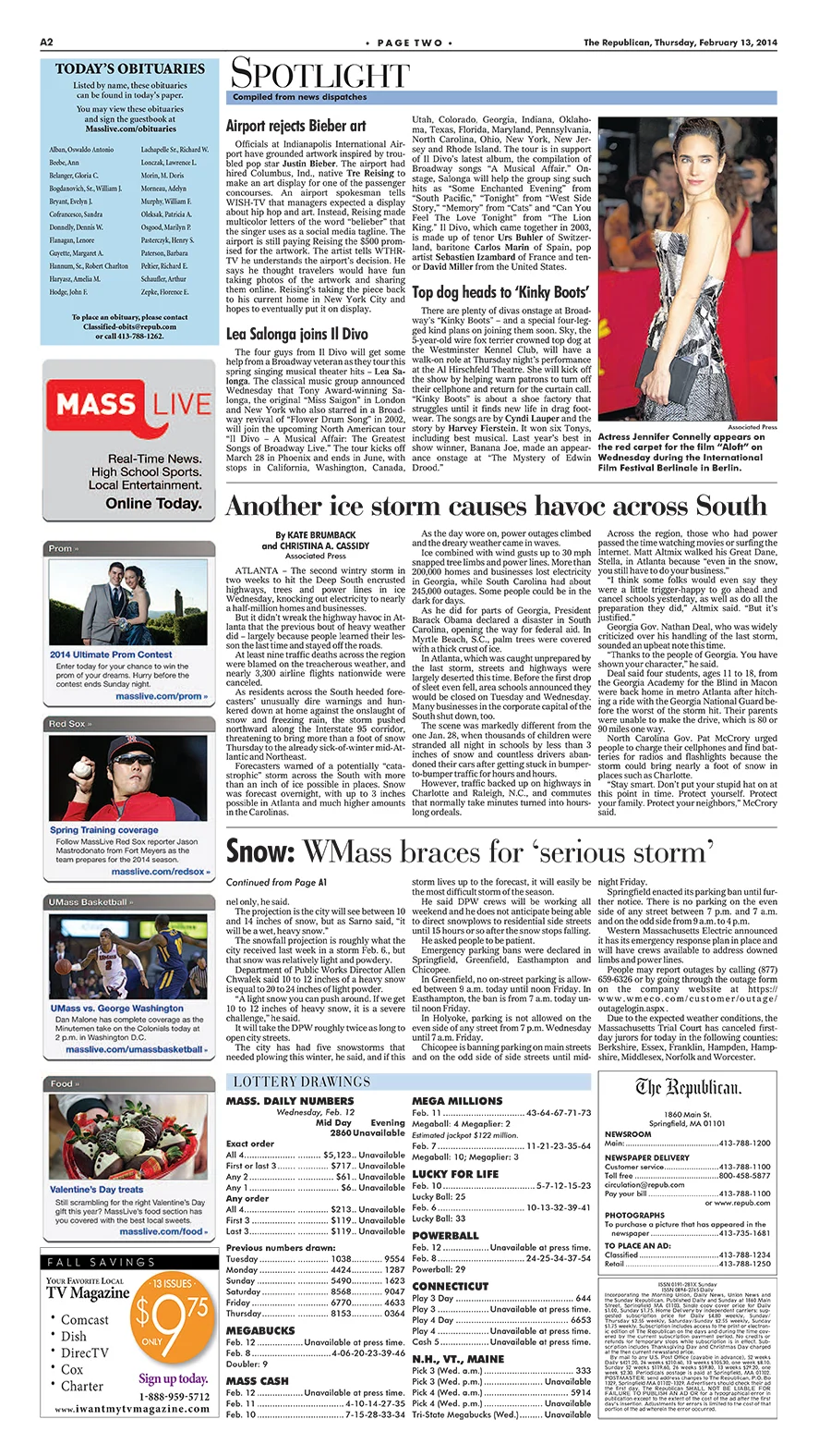
In a comparison of some inside pages before the redesign and after, I brought in more air between the dense blocks of type, a definitive hierarchy in the headlines and layout and the removal of needless visual clutter.

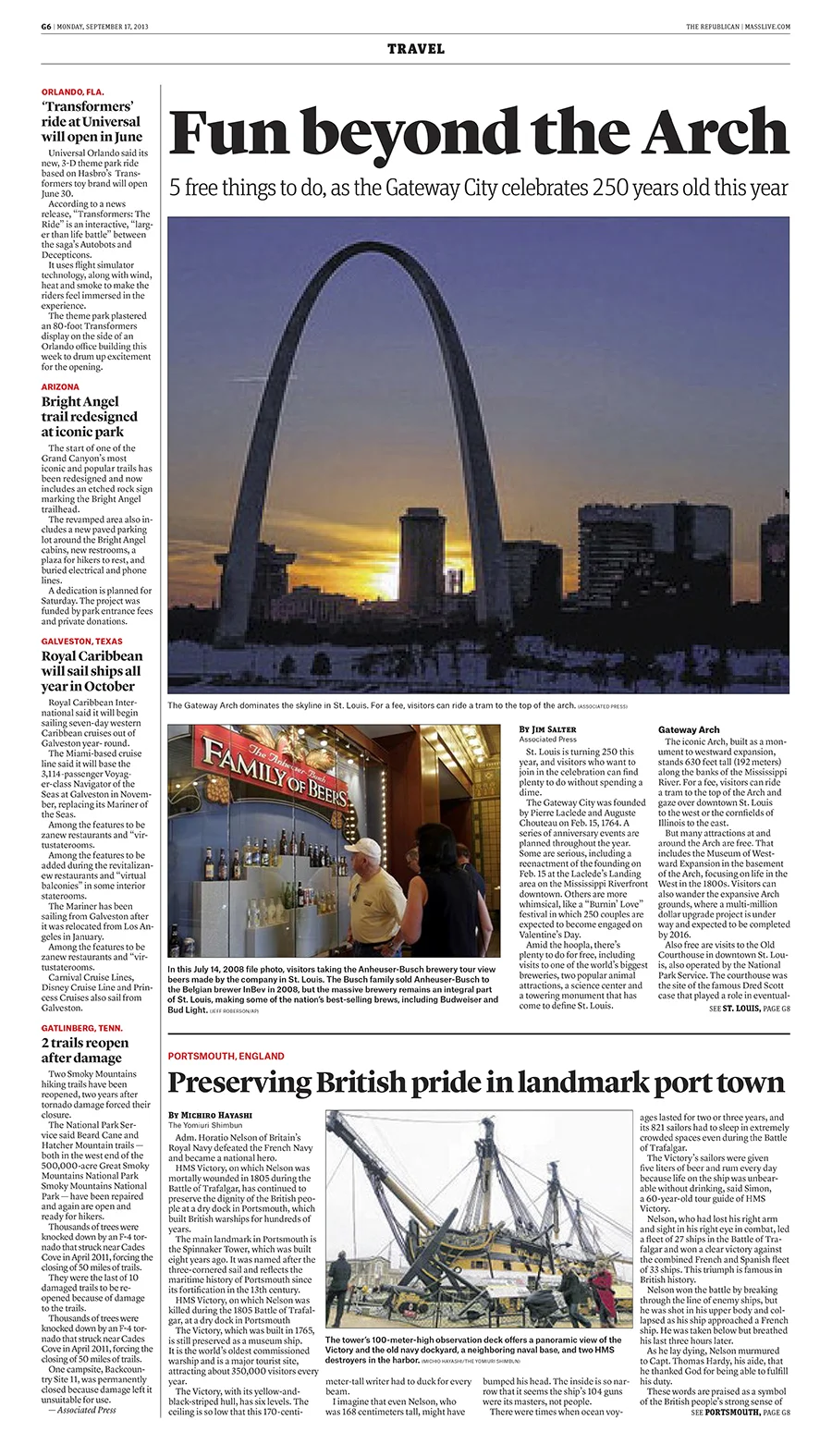


A sampling of some of the inside pages from the redesign include local, national and world pages, a travel page, and inside sports pages centered around local columnists and curated content from MassLive.com on the Celtics, Red Sox, NASCAR and UMass.

after

before
The redesign also included a redux of Weddings magazine and weekly Spanish-language publication El Pueblo Latino, which I oversaw with designer Jen Cieslak. In order to save money and streamline the production process, we used the same fonts and color palette, but in a different context. Lyon Display became poster-size for the new El Pueblo Latino, using distinctive ligatures to add personality, and Unit Slab became styled for headlines.
newspaper Weather Graphics redesign
As part of a broader digital-to-print restructuring of New Orleans’ The Times Picayune and an overall redesign of their daily newspaper, I designed a new half-page weather graphic. After weeks of testing fonts, I chose Klim Type Foundry’s Domaine and Tiempos, and Font Bureau’s Benton Sans and Poynter Agate Zero for the newspaper’s new design. 2016
In 2016, four newspapers — The Birmingham News, The Huntsville Times, The Mississippi Press and The Mobile Press-Register — merged their production facilities with The Times Picayune. All five newspapers were to be published out of one facility, which meant streamlining the design was crucial. To improve efficiency and consistency, I designed the weather graphics so that content and design could be easily sharable. I chose the fonts in the banners to reflect a brand personality in each product: Font Bureau’s Ironmonger for former steel town Birmingham, Klim’s Domaine Sans for Mardi Gras originator Mobile and Christian Schwartz’s Oxide for aerospace hub Huntsville. 2016


Ironmonger speaks to a former steel town in Birmingham.

Oxide exudes a military industrial feel for Aerospace and Technology hub Huntsville.

Domaine Sans contrasts as well as complements Domaine Display for Mobile, a neighboring Gulf city.

Domaine Display’s strokes evoke the curvatures of New Orleans’ fleur de lis.
As part of the redesign of New Orleans’ and Alabama’s weather graphics, I also designed these weather icons for use with the forecasts. AccuWeather requires most of the icons — sunny, partly cloudy, partly sunny, rainy, snowy, etc. — in order to process and build the weather graphics each day, but I designed additional icons for nighttime forecasts. 2016


the vote for gay marriage
In 2010, there was a vote in the New Jersey Assembly to pass a bill to sanction gay marriage in the state. Before the crucial vote, I designed this graphic for The Star-Ledger to show where the votes were split among key legistators. The bill was defeated. 2010
9/11: 10 years later
Instead of exploiting the searing images of planes flying into the World Trade Center, I designed a cover for our anniversary coverage reflective of the moment from an essay written by Mary Jo Patterson. 2011
After japan
After the devastating meltdown at Japan's Fukushima power plant in 2011, I designed a Perspective splash about how nuclear plants in and around New Jersey could be under a similar threat. 2011
On the eve Of irene
Before Hurricane Irene hit the New Jersey coastline in 2011, our forecasts said it might be the worst storm in the state's history. To highlight the importance of preparedness, we visualized the latest information. 2011
kid rock
For an interview with Kid Rock, who was performing at the PNC Bank Arts Center, I designed a centerspread for the Asbury Park Press' Jersey Alive! 2008
summer blast-off
For Jersey Alive!, the Asbury Park Press' weekly entertainment tabloid, I designed a page about Scott & Todd's 2008 Summer Blast-Off to feature Lifehouse. 2008
bamboozle festival
Every year, I would design a Jersey Alive! centerspread and cover for the Bamboozle Music Festival. Because of the bands involved, I went for an ’80s arcade theme. 2008
Toms River Fest
Daughtry and Carrie Underwood of ”American Idol,” as well as Avril Lavigne were to play Toms River Fest. I designed the centerspread for Jersey Alive! 2007
the new jersey budget
Before New Jersey Gov. Chris Christie introduced his budget for the year, Data Editor Tom Meagher, Stephen Stirling and I put together a visual guide to show how the state spends tax money for the front page of The Star-Ledger. 2010
the scout
I created The Scout as a weekly ode to the movies inside the Asbury Park Press' Jersey Alive! section. Each week, I would research and write the content, a combination of data analytics and commentary, and design the graphics and overall composition. 2007-08
the killing cycle: the inside story of the essex county homicide squad
For three weeks in July 2011, a newly formed homicide task force in Essex County permitted Star-Ledger columnist Mark Di Ionno and photographers Aristide Economopoulos and Andrew Mills unprecedented access to their work. They hid nothing: Crime scenes, strategy, lab work, theories and solutions, interrogations and arrests were all open and uncensored. From this access the reporting team has painted an inside story of violence and detective work most readers will not have heard or seen. Our goal was to present a story that would expand the public's understanding of the community crisis that is urban crime. 2011
moe.
Using the headline and scheduled event’s Fourth of July date for inspiration, I designed this Jersey Alive! centerspread from reporter Alex Biese’s interview with moe. 2007
val emmich
Using a spray-paint and stencil motif, I designed a centerspread for Jersey Alive! from reporter Chris Jordan’s interview with Manalapan, N.J., musician Val Emmich. 2008
Katy Perry & Warped Tour
I designed this Jersey Alive! centerspread, a preview of the Warped Tour, from interviews with Katy Perry and Charlotte Sometimes. 2007
Puddle of Mudd
For Jersey Alive!, I designed this centerspread from correspondent Ed Condran's interview with Puddle of Mudd. to preview their upcoming concert. 2007
Irene’s Wrath
For the Star-Ledger's coverage of Hurricane Irene, I researched reports from the Associated Press and designed this information graphic showing the path of Irene's destruction as it came up the East Coast of the United States. 2011
the munchmobile
For two years at The Star-Ledger, features editor Enrique Lavin, food columnist Peter Genovese, illustator Neville Harvey and I would come up with a fun concept for the summer’s Munchmobile. A tradition for Star-Ledger employees and readers every summer, the Munchmobile invites several guests to travel the state with Peter to eat pizza, ice cream, sandwiches and more and report about their experiences in the next week’s paper. Neville and I would illustrate and design the hot dog mascot, the wrap for the Munchmobile van, as well as, weekly pages about the Munchmobile’s adventures. Our inspiration was low-grade monster movies from the ’50s. The typography is from House Industries. 2011
holiday gift guide
The week before Christmas, I designed five Star-Ledger Today covers that showcased last-minute gift ideas. I broke open the grid so the gifts could come to life. 2009
’Priscilla’ on Broadway
For The Star-Ledger’s Sunday Arts & Escapes section, I designed a cover about Broadway’s newest musical, “Priscilla, Queen of the Desert.” 2011
the wreck of the lady mary
The Star-Ledger journalists Amy Ellis Nutt and Andre Malok spent months investigating the sinking of a Cape May-based scallop boat that left six dead and spared just one crew member. This five-chapter Pulitzer Prize-winning series was printed in a 20-page special Sunday Star-Ledger section. George Frederick, The Star-Ledger's director of innovation, and I collaborated on the design and layout. Andre Malok did the photography, videography and graphics. 2010
’Psycho‘ Anniversary
For the 50th anniversary of Alfred Hitchcock’s “Psycho,” I designed a Sunday cover for The Star-Ledger from Stephen Whitty’s column. 2010
Summer Movie Review
I designed the Today cover from Star-Ledger film columnist Stephen Whitty’s review of 2010’s summer movie season. 2010
2012 Election Preview
I illustrated and designed the Star-Ledger’s Perspective cover from a story about Obama and Romney’s myopic 2012 political campaigns. 2012
strong at any cost
A three-part Star-Ledger series on the secret world of steroid use by law enforcement officers and firefighters, written by Amy Brittain and Mark Mueller, won the George Polk Award for Metropolitan Reporting in 2011. I designed and illustrated each chapter in the series. 2010
a homemade ‘Raiders’
Three childhood friends shot their own version of “Raiders of the Lost Ark.” I designed the centerspread from Stephen Bove’s story. 2008
‘Speed racer’
I designed this Jersey Alive! centerspread from an Eleanor O'Sullivan’s interview with Paulie Litt, star of the Wachowskis’ ‘Speed Racer’. 2008
gift guide for teenagers
For the Asbury Park Press’ Whatever section, a weekly tabloid for teenagers, I designed this holiday gift guide. 2004
macy’s parade
I designed a centerspread about the Macy’s Thanksgiving Day Parade. I did a photo collage of balloons and skyscrapers. 2008
the dna of ’80s movies
For the Asbury Park Press’ Jetty magazine, I researched and designed this full-page graphic dissecting popular ’80s movies. 2006
christie’s political orbit
For the front page of The Star-Ledger, I designed a graphic showing all of the advisors and political veterans in Gov. Chris Christie’s inner circle. 2012

jon stewart interview
For The Star-Ledger’s Perspective section, I designed a cover from Dave D’Alessandro’s interview with The Daily Show’s Jon Stewart. 2011

fall movie preview
For film columnist Stephen Whitty’s fall movie preview, I designed this cover for the Star-Ledger’s Arts & Escapes section. 2012