Frances & Joe’s Wedding Invitations: Chapter 4 — Going Off-Script
Zzzzzzzzzzzzzzzzzzzzzip.

Usually at the beginning of a project, I would sharpen a pencil with a half-decent eraser and start rubbing lead to paper. Instead, on a whim, I zipped open my arsenal of markers.
‘Allegory of the Cave’
I remembered a project I did years ago to design a hierarchical system for Plato’s “Allegory of the Cave,” from the Greek philosopher’s “The Republic.” It began as theoretical. How to translate a philosophical Socratic dialogue into a clear, concise diagram? I decided to start in the abstract. I dusted off my paintbrushes and began to sketch in acrylics, embracing the permanence of the ink. What I was after was a visual representation of what it would look like — and ultimately what I could see — inside that cave described in Plato’s dialogue.
Each page of sketches was a chipping-away at how I would interpret “the shadows” cast on the wall of the cave. What would I see? Would turning off the lights, the ambient light from the moon casting a soft elliptical glow on the wall, engage my imagination even more? So began an exploration that evolved from sketches in raw brushstrokes to rigid geometric shapes that successfully represented the stages of consciousness in the allegory. This is just one example where, as a graphic designer, I loved the journey.
The journey begins
With these invitations, I was inspired to entertain that method again. I popped the cap off my jet black brush marker. It was playtime.

I didn't know if the brush tip would eventually make an appearance, or even a cameo, in the final design. At that point, it wasn't important. I was engaged in serious play.

A sampling of thumbnails from my sketchpad. On the first few pages of sketches, my technique was wobbly, but I kept at it until I felt like I had a grasp on applying the right amount of pressure for ink flow to nail those natural progressions between thick and thin. I also had fun with style, such as exaggerating the descender in the “J,” the finish on the “e” and the overall arched trajectory of the word “Joe.”
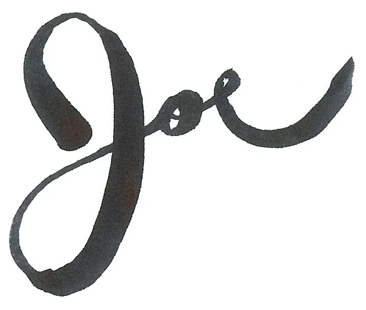
Out of hundreds of sketches, this one made the final cut. Next, I took the script into Photoshop to do minor edits to the edges and to add color.
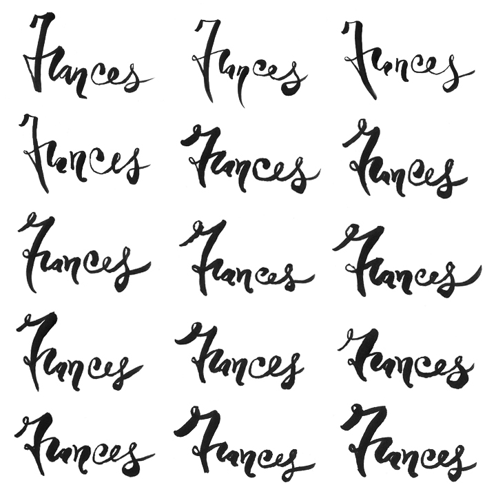
A very small sampling of sketches from my sketchbook, in chronological order. I began with very high-contrast strokes and a tall x-height as I was finding my balance with the brush tip. I knew where I wanted to go with this script from the start, so there weren't many variations to the style of the individual characters.

Out of hundreds of sketches, this one made the final cut. Next, I took the script into Photoshop to do minor edits to the edges and to add color.

A collection of ampersands from my sketchbook. Joe and Frances preferred the formal quality of the ampersand to a scripted “+” symbol or the word “and.”
As I drew Joe and Frances’ names in a variety of styles, I quickly fell in love with the process. I continued to sketch their names, with each stroke, the marker felt more like a natural extension of my finger. Each night, I would practice my thicks and thins and the steady flow of my hand across the page. Legibility was just as important as style. As I explained in the first chapter, the brush script eventually became a playful contrast to the font I chose for text, per Frances’ inspiration: Kris Sowersby’s Pitch. When I presented the first draft of the invitation, Joe and Frances exclaimed their love for the scripts I had showed them.
Drawing upon color
The wedding color was emerald, with accents of gold and cream. By drawing in black, I was able to use Photoshop to add and adjust the color, rather than relying on any choices of green among the marker selection available to match the particular shade required. Variations of gold were tested as an accent on the invitation, but a monochromatic palette with a minimal, judicious use of color brought more elegance and bequeathed more of the stage to the whimsical drawings and hand-lettering.

The final version of the script in a vibrant emerald green. In Photoshop, my goal was to retain the imperfections of the script edges as well as the visible texture of the wash in the ink as it appears on paper. Losing that texture would’ve been detrimental to the feel of the invitation.
Beyond brush script, I also drew characters in caps and upper- and lowercase and crafted decorative glyphs for use on the invitation. I would return to pencil now and again to quickly articulate an idea in my head on paper, but I would finalize it in marker. Some of these characters and glyphs would not make it into the final design.

A set of glyphs I drew for the invitations, including highlights and arrows.

From my sketchbook, a series of words in all-caps and in script for the invitation.

Using a brush tip, practicing the alphabet in my sketchbook.
Branching out
As the project grew with the suite of invitations, so did the need to expand the use of lettering across the collection. All of the sudden, there was a lot more display type, and I didn't want to pull any power away from the main invitation’s brush script. I developed a couple more scripts for the save-the-date and R.S.V.P. card, but for the remainder of the collection, I sought to do something different.

Scripts from my sketchbook for the save-the-date card.

From my sketchbook, scripts I drew to accompany the drawings of entrées in the R.S.V.P. card.
Inspiration soon came: I was reminded of a marquee. Soon after, I drew a series of characters inspired by vintage light-up letters with inline bulbs. The industrial yet romantic voice of the lettering, no matter how muted in its abstract representation, would speak directly to Pitch, which is Sowersby's love letter to the typewriter. I would use the marquee-style lettering on the R.S.V.P. card, as well as on the travel information card.

At top, my first sketch for the marquee lettering. Above, the final version of the R.S.V.P. characters with emerald shadows.

The “B” was sketched as a dropcap for a block of type on the travel information card. Sketches in pencil and marker led to a final character with an emerald shadow.
I also drew individual characters from Pitch’s character set to bring some cohesiveness to the display type, and the suite as a whole. I did this on the save-the-date card and the invite to the second reception in Georgia.

Two versions of display type I sketched out for the invitation to the second reception. On the left, an art deco inspiration that didn't make it through edits. On the right, characters I drew based on Kris Sowersby’s Pitch.
The hand-drawn type, the drawings and text would eventually come together as part of the entire suite.