


Seamless Dining by Grubhub
Our team had 10 days to design a new point-of-sale system for Grubhub to bring efficiency to restaurants who use on-demand delivery and takeout platforms. This is how we did it.
a prologue
At the beginning of my fourth UXDI project, I was assigned to a group with two other classmates — Chris and Smriti — to develop a project plan. This was to be our passion project, and it quickly became just that.
Our team was brought together based on answers we provided in a survey. The three of us had a big interest in cooking, or more broadly food and drink.
Married to a chef and food writer, and as a pizza cook on weekends at one of the best restaurants in New Jersey, I’m known to devote most of my Instagram posts to food photography. Food is a huge part of my life.
a problem to solve
For this project, our team was not given a problem to solve — we had to find one. We began the process by sharing our strengths and weaknesses with one another, as well as, some pain points with apps we often experience in our lives. Then, we set off to research on our own. After a quick Google Hangout session the night before, each of us came back the next day with a potential project we could develop over the next 10 days.
One idea was to expand Grubhub’s portfolio with a seamless integration of their delivery and in-house point-of-sale systems. Another was a project to improve the user experience of ordering meals through Blue Apron. A third idea was to expand on-demand home cleaning and handyman service Handy’s menu of offerings to include chefs who can come to your home to cook.
the proposals
We discussed each option throughout the morning. We needed to submit a proposal by noon, so we needed to agree on one of them.
Based on feedback from one of our instructors, we realized Handy as a brand was all wrong for one of our proposals. We decided to switch Handy out in favor of Whole Foods, which was a more natural fit. But upon further investigation of the market for on-demand home chefs, and after reading a story about the woes of start-up Kitchensurfing, which booked private chefs to cook dinners in people’s homes, we decided against it.
As for our Blue Apron pitch, we agreed it was too close in scope to our previous project, the objective was which was to add a new feature to an existing brand’s desktop or mobile platform. The proposal to improve the menu options and checkout flow for Blue Apron addressed an obvious pain point for their users, but we needed to seize on an area of opportunity for an existing brand, not just improve the user experience of a current feature.
It was settled.
Despite some reservations about the potentially immense scope of the 10-day project, we would pursue the Grubhub pitch. We drafted a final proposal to submit to our instructors for approval. It was accepted, and the core our mission began. We would need to validate the problem with research.
brand research
After our proposal was accepted, we began to research Grubhub in depth, searching for business goals, company history, analytics, development strategies and more.
Matt Maloney and Mike Evans co-founded Grubhub in 2004 in Chicago. The two web developers were tired of having to call up restaurants and read them their credit card numbers. They wanted to create an easier way to order food.
Grubhub is by far the largest of the on-demand food delivery services, with more than 40,000 local restaurants in more than 900 cities across the U.S. and the U.K. Grubhub’s target market is primarily independent mom-and-pop restaurants. The company provides diners with a personalized interface that allows them to search for local restaurants and place an order all on a single platform. After an order is placed, the platform provides diners with information about their order status, i.e. tracking and estimated delivery time. In addition, Grubhub makes re-ordering easy by storing previous orders, preferences and payment information.
Their portfolio includes previous competitors Seamless, AllMenus, MenuPages, Restaurants on the Run, DiningIn and Delivered Dish.
KPIS and analytics
In our research, we stumbled onto one quote from Grubhub co-founder Mike Evans. He was asked about the company’s key performance indicators (KPIs), measurable values that demonstrate how effectively a company is achieving its business objectives. His response:

“[Our three KPIs have always been] Customer satisfaction. Customer satisfaction. Customer satisfaction.”
— Grubhub Co-founder Mike Evans
In their October 2015 economic impact study, Grubhub released some metrics about their progress in helping local restaurants increase market awareness and sales volume:
- After joining Grubhub, restaurants grew their monthly takeout revenue by an average of 30 percent.
- One in five restaurants doubles its revenue after working with Grubhub.
- Grubhub cuts restaurant processing time by more than 50 percent.
Knowing that efficiency, convenience and customer service were the biggest drivers of innovation at Grubhub, we knew that our proposal to expand into the dine-in process would only add value to Grubhub’s business model.
Next, we would need to locate users to interview who’ve either worked in a restaurant using a POS, or point-of-sale system, or have used Grubhub, Seamless or similar on-demand food delivery service.
making a screener
In order to narrow the field of users to survey and interview, we assembled a screener with five questions and sent it out to our social networks on Slack, Facebook and Twitter. The questions were meant to draw out users who have worked in the restaurant business and/or used an on-demand food delivery service such as Grubhub or Seamless.
- Do you live or work in the New York City area?
- Do you or have you ever worked in the restaurant or food industry?
- Have you ever used an on-demand food delivery service such as Grubhub or Seamless?
- If you live or work in NYC, would you be available for a one-on-one interview before Thursday?
- If you don’t live or work in NYC, would be be available for a phone interview?


We got 21 responses over 4 days. Of those surveyed, 76 percent are working or had worked in the restaurant industry, and 82 percent had used an on-demand food delivery service such as Grubhub.
From this pool of users, we would conduct interviews and send out follow-up surveys.
topic map
Before we would write up a set of interview questions, we drew up a topic map on the whiteboard. The object of the topic map was to reveal all of the satellites circling the central problem we were trying to solve.
In effect, we were attempting to solve for the restaurant, whose rents have skyrocketed and whose reliance on on-demand delivery services to pay the bills has only exploded. But by solving for the restaurant, we would indirectly be solving for the restaurant customer. Increasing efficiency can only improve the experience of eat-in and take-out diners, not only in meal ordering and delivery, but in closing the check, as well.

Bill transfer, meal coursing, check-splitting, reservations — these would all be potential areas to investigate as we navigated the process to develop our design.
competitive & comparative Analysis
After doing research on Grubhub, we realized we needed to know more about POS systems: How they’re purchased, how they function, common pain points, common features and more. It would be a huge challenge, however, given our almost non-existent access to these closed systems.
For our competitive and comparative analysis, we examined seven different point-of-sale (POS) offerings, such as Square, Revel Systems, ShopKeep and TouchBistro. Through feature comparison, we tabulated the features of each. However, because of our limited access to these closed systems, contextual inquiry at several restaurants became a necessity to better understand how users — in this case, servers, hostesses, managers and other restaurant staff — approached them.

Nonetheless, our analysis helped us figure out who the competitors were and understand the expectations in the market. We also did research on the restaurant reservation app OpenTable in the event that feature became an essential part of our design.
Many of the features of each system we compared from their respective websites, as well as from outside sources such as Merchant Maverick, which provides detailed reviews of each of the products.

As you can see above, many current modern POS systems contain, more or less, many of the same features, which we would need to include in our prototype. That was the biggest value of our feature comparison, as well as discovering the application programming interfaces (APIs), custom software integrations that pull data from outside sources, or third-party vendors with which many of the systems have partnerships. What would obviously set them apart would be in how the features work, an attribute we’d only be able to properly evaluate through interviews and contextual inquiries.
surveys
Once we began to receive responses to the screener, we began to send out a follow-up survey. In our survey, which we sent to respondents who we couldn’t interview face-to-face, we asked 10 specific questions about their point-of-sale (POS) experience, as well as, how a restaurant’s front-of-house (FOH) operates. We got 10 responses. These were the results.
“We will cut deliveries if it gets to busy at the restaurant.”
— Survey Respondent No. 7


Because we didn’t have direct access to POS systems, and because the success of our new product relied heavily on restaurant staff over patrons, we realized quickly that observing the workflow at a restaurant, particularly ones that deal with on-demand delivery, would be most valuable for us.
contextual inquiries
Contextual inquiry was a vital part of our research, as it exposed us not only to how a restaurant processed in-house orders through their current POS systems, but also how they multitasked with Grubhub, Seamless and other on-demand delivery services.
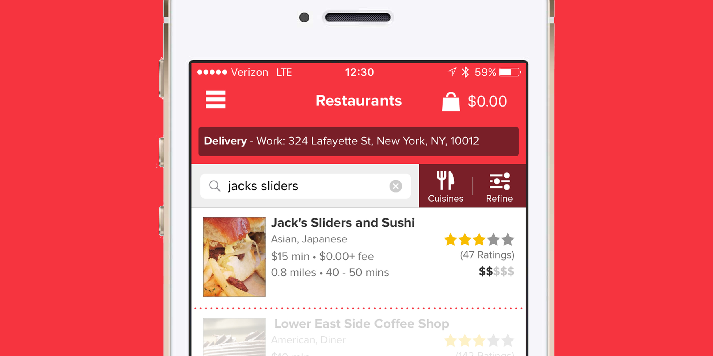
We chose Jack’s Sliders and Sushi on 3rd Avenue for our first contextual inquiry through the Grubhub app.
We chose restaurants who used Grubhub for delivery and takeout in most cases. These were highly enlightening experiences, especially when managers, hostesses and bartenders were willing to talk to us about how they worked, divulging buried pain points along the way. With each new restaurant, similar patterns of behavior quickly emerged, as we soon discovered a cumbersome, if tortured, process of coordinating orders with Grubhub. We went to Schnipper’s, Eisenberg’s Sandwich and Potbelly Sandwich Shop, but, by the end of our research, five restaurants gave us our greatest insights.

where we traveled
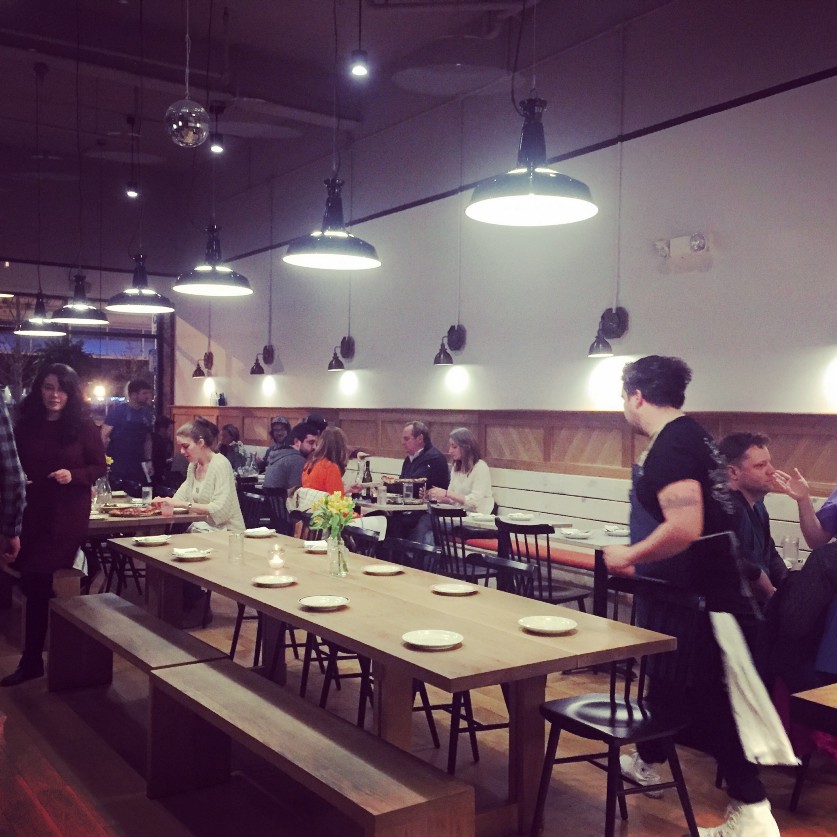
We went to several restaurants in and around the Flatiron District of New York City, including Schnipper’s, Eisenberg’s Sandwich Shop, Republic, Jack’s Slider’s and Sushi, The Coffee Shop, Roast Kitchen and Potbelly Sandwich Shop. We also traveled to Talula’s in Asbury Park, N.J., to observe staff using their Revel system during a contextual inquiry.
the ‘A-Ha’ Moment at Jack’s
The biggest moment for us during this entire project happened on our visit to Jack’s Sliders & Sushi on 3rd Avenue. We used the Grubhub app to find a restaurant in their network that was open for lunch. We were surprised by what we found.

The hostess and server behind the counter at Jack’s Sliders and Sushi on 3rd Avenue in New York City.
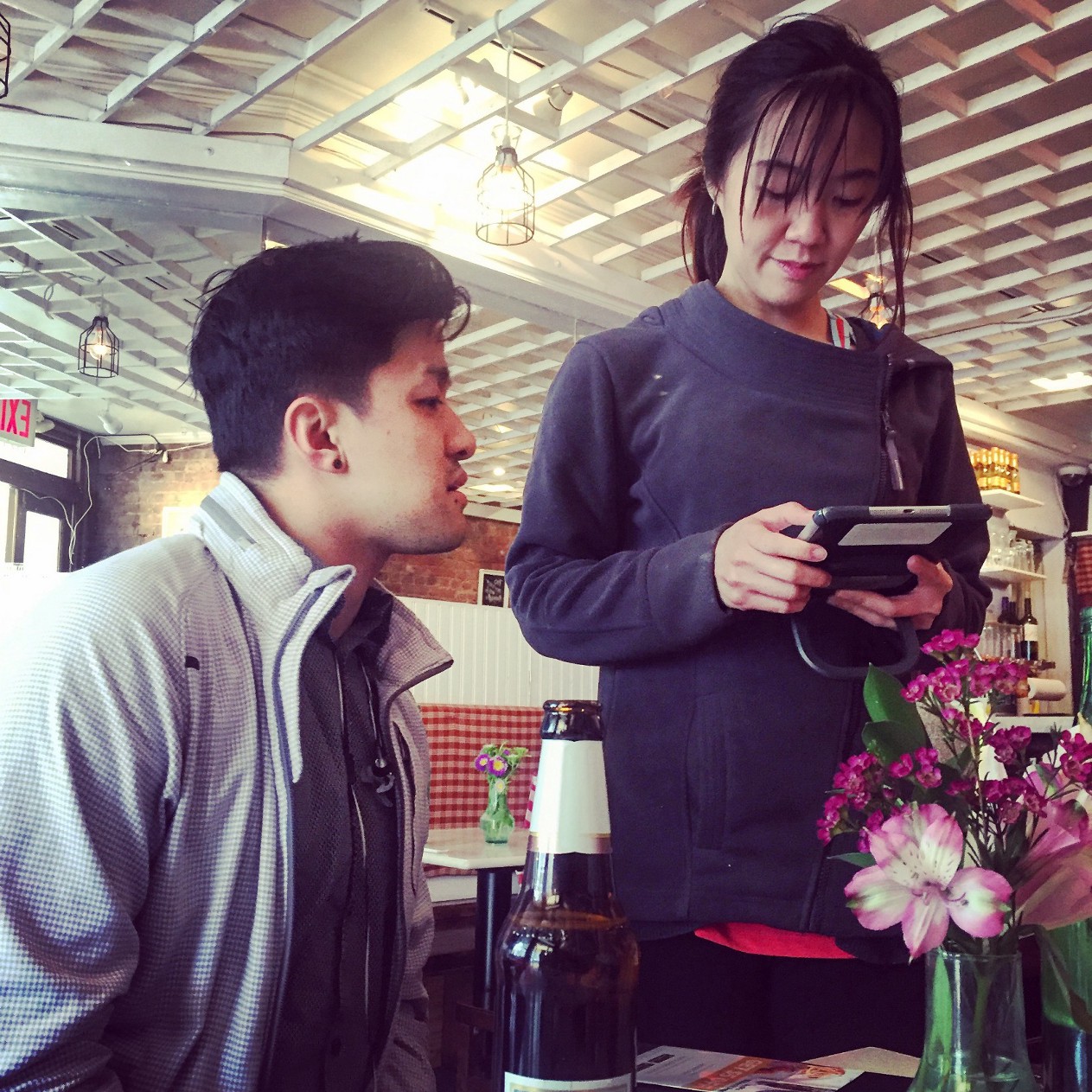
Using TouchBistro at our table, our hostess and server helps order our items.
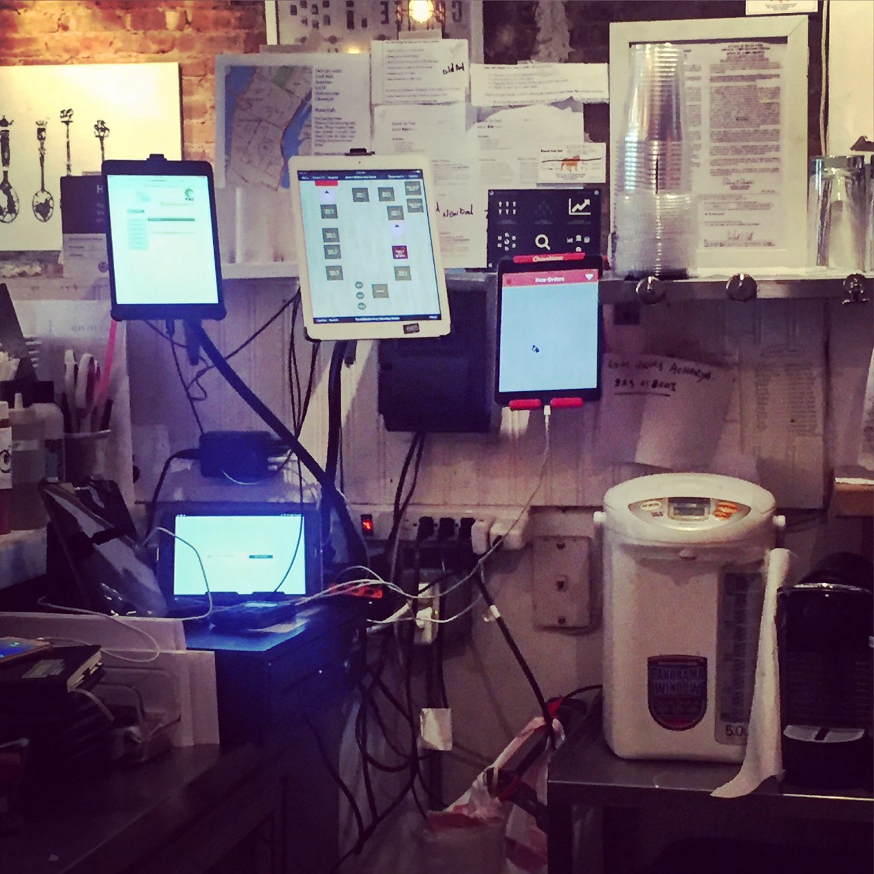
The multiple tablet screens behind the counter at Jack’s Sliders and Sushi help the hostess facilitate delivery orders from on-demand platforms.

We ordered food to get the most out of the research. The Yuzu Miso Salmon at Jack’s Sliders and Sushi in New York City.

Chris inputs his tip amount into a second device, a tip calculator, during his checkout process at Jack’s.
On our first stop, we ordered lunch. Upon ordering we quickly noticed the device the hostess/server brought to the table, a newly purchased in-house TouchBistro on iPad mini, which she would bring to the table to take our order. In the process of our inquiry, we discovered that she used multiple on-demand food delivery services to “pay the rent.”
What was shocking was how she managed to multitask the traffic: Her hostess station revealed a control center of more than five screens, each one tapped into a delivery app. There was Grubhub, Postmates, DoorDash and Eat24. It was like something out of “The Matrix.”

The setup of multiple iPad screens behind the counter at Jack’s evokes this scene from “The Matrix.”
When she processed our final payment, she did so at our table with her TouchBistro-integrated iPad mini and a tip calculator with a credit card reader.
- Using the equipment, we didn’t understand the need to juggle two separate devices. Using the latest technology didn’t make closing our check a better experience over pen and paper.
- Consolidation. Nothing is integrated for multitasking. The more on-demand services you use, the more cumbersome the process becomes.
- Also at the table with guests, the hostess juggling two different mobile devices — you sign your signature on one, pay with your credit card and blindly tip on the other — could be more streamlined.
a visit to talula‘s
Observing the staff at this Asbury Park hotspot take orders from guests and process each item through Revel, their POS system, helped us devise user flows for personas and give us insights into potential pain points. We also asked a floor manager and waiter questions about their workflows. Talula’s doesn't use Grubhub or another on-demand delivery or takeout platform, but observing their experience with Revel was valuable.


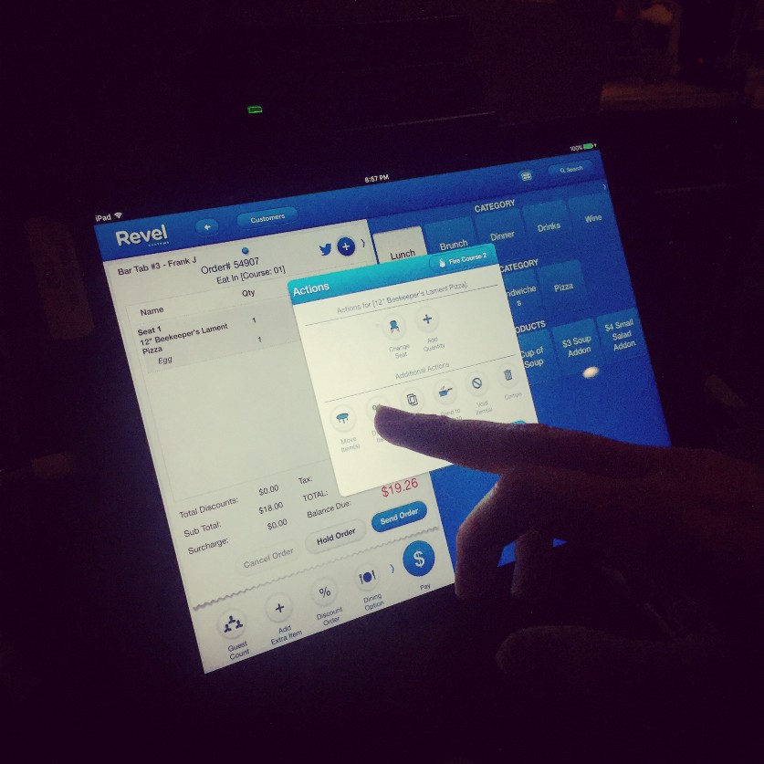
Clockwise from top left: Outside Talula’s in Asbury Park; inside the dining room on a quiet Wednesday night in April; a waiter inputs an order into their Revel POS system; and a close-up of Revel‘s interface.

I ordered a pizza, a Beekeeper’s Lament, with extra toppings to be able to observe how their POS system works when you need to add on ingredients
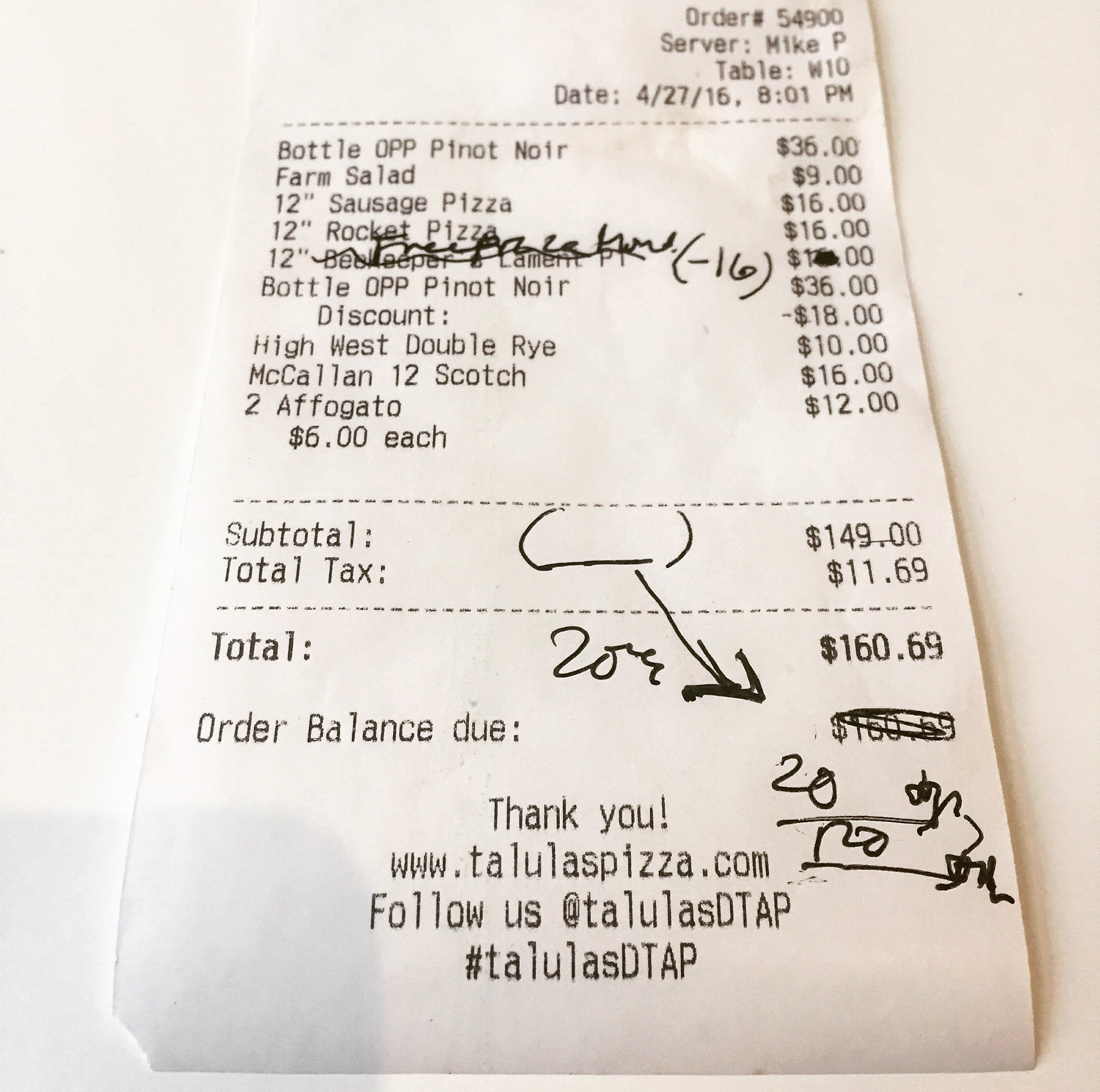
A typical receipt at Talula’s off-season on Mondays can look exactly like this because special discounts, such as “Buy One Pizza, Get One Free” aren’t able to be easily integrated into the system quickly.
Here’s some of the observations I made during my contextual inquiry at Talula’s:
- They have to stop doing processing deliveries when it gets too busy in-house.
- They have to use a separate iPad app, No Wait Host, to take and queue reservations.
- Revel doesn’t have enough prompts to help prevent errors when placing orders into the system.
- Eighty-sixed (86’d) items and special promotions are not inputted into the system because of how inconvenient it is to change the settings in Revel.
A Pattern Emerges
During the busy lunch rush, we stopped in to observe the staff at Roast Kitchen, a fast casual restaurant in Union Square. What we saw was that Grubhub orders were coming in on a separate ticket, but then reinputted into their in-house POS system. They also had a designated area for takeout to alleviate the in-house dining and takeout flow.

the pick-up window
Roast Kitchen has a counter designated for pick-up and delivery only in order to keep it traffic moving in the dine-in line.

input the fax
Like many of the other restaurants using Grubhub or other on-demand delivery platforms, Roast Kitchen re-inputs faxed orders into their own POS system in order to process them through the kitchen.

the manager's station
At the back counter in The Coffee Shop shows a laptop, at right, with several tabs open so the manager can process orders from multiple services.
Here’s some of the observations we made during my contextual inquiry at Roast Kitchen:
- There are staffers dealing solely with delivery and takeout.
- The first of several instances where a Grubhub order ticket would be re-entered into the in-house POS system for firing to the kitchen.
At Republic, an Asian noodle shop in Union Square, a pattern emerged with how staff dealt with Grubhub orders. The hostess, Vianlee, multitasked at a station at the center of the restaurant. She also had to re-enter incoming Grubhub orders into their in-house POS from a laptop. Here’s what we observed:
- Re-entering Grubhub orders into the in-house POS wasn’t efficient.
- Dealing with Grubhub order errors took time away from hostessing.
The pattern continued at the Union Square restaurant The Coffee Shop, where we sat at the end of the bar during happy hour and observed the manager process in-house and Grubhub orders. We talked with him later, and without hesitation let his pain points with Grubhub be known. Here’s what we observed:
- Communicating with Grubhub through fax to correct menus and pricing is a pain.
- Like Republic and Roast Kitchen, the manager re-enters Grubhub and other on-demand delivery orders into an in-house POS system.
- Their Micros POS system is outdated, glitchy and expensive to replace.
“[The POS interface] should be as easy as the menu.”
— A bartender, during our contextual inquiry at The Coffee Shop
The bartenders could only complain in profanities about their POS system, which works on old Oracle Micros software. They revealed how it freezes up sometimes and isn’t intuitive to use — it’s something you have to learn at length how to use correctly.
Everywhere we went, we observed obvious pain points in how restaurants were processing orders, particularly in multitasking between in-house and on-demand delivery orders. The findings from these last two restaurants only validated our overall research.
Based on our feature comparisons with competitors and analysis from contextual inquiries, we would begin to prioritize which features were achievable and essential to our solution and which ones were not.
interviews
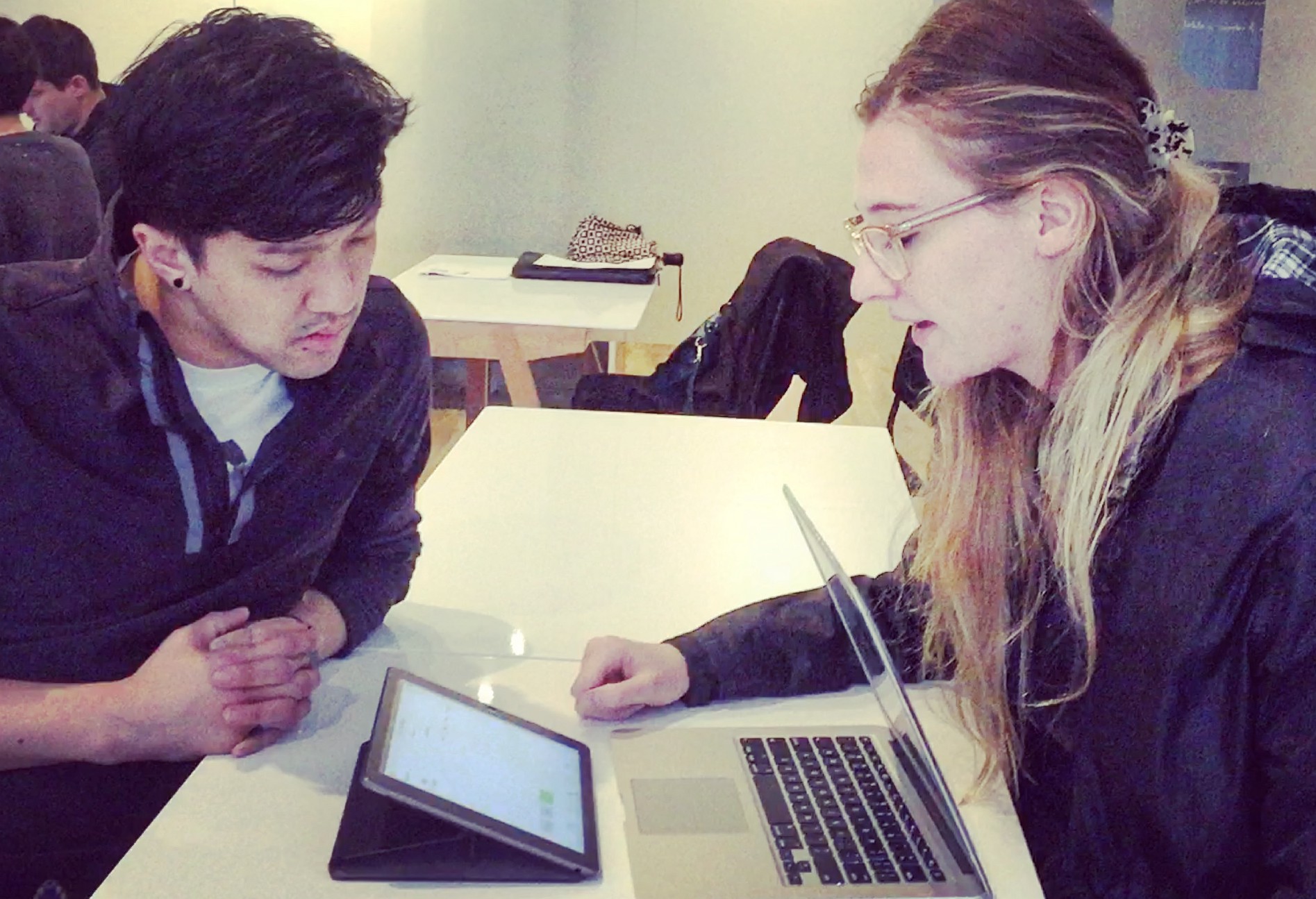
We conducted a total of three interviews over a two-day period. Of the users we talked to, two currently work in the restaurant business, while one no longer works in the food industry. We took notes and audio-recorded the conversations, which varied from 30 to 45 minutes in length. Our goal in these conversations was to uncover hidden motivations, behaviors and pain points.

Chris interviews a user who has worked in the restaurant industry in the past.
In the first interview, we talked to a former employee at Quizno’s and a family-run Chinese restaurant. These were the biggest takeaways from the interview:
- When she worked at Quizno’s, long lines would stress her out.
- If an item on the menu was out of stock, they would “86,” or discontinue, it through verbal communication, not within a POS.
- Preferred to be texted for reservation notifications.
- Loves to use OpenTable for the benefits and rewards.
In our second interview, conducted the same day, I talked to a floor manager in her early 30s who has worked in the restaurant business for years.
- Even in a team environment, communication between servers about course delivery can be inconsistent.
- When doing sales or special promotions, the servers have to write out a receipt with edits, which can be painfully slow and error-prone.
- They update the dinner menu nightly, but not through the system because it takes too long.
Our third interview, conducted the next day during happy hour, was with a manager at a NYC bar and restaurant in Union Square.
- Grubhub consistently has incorrect menus and pricing.
- The process of submitting information to Grubhub is not efficient, typically sent by a fax machine.
- Add-on items are a problem when users order through Grubhub. The restaurant has to contact the user to communicate pricing and fulfill payment through Grubhub, which creates a bottleneck.
Despite our surveys and interviews, a large chunk of qualitative data was missing from our research. That’s where our contextual inquiries would save the project.
pin-ups
During our scheduled pin-up, we presented our proposals to the class to receive feedback. Our proposals included preliminary research to validate our problem statement, as well as, a project timeline, proposed platform and final deliverables. The constructive feedback we would receive wouldn’t just force us to question the wording of our problem statement, but whether Grubhub, as the brand, was the right one for this problem.
Our original problem statement: Restaurants want to increase efficiency to enable the staff to focus on overall customer experience, resulting in customer loyalty and increased revenue.
The biggest question was “How?” “Sounds like a need more than problem,” one commenter posted. “How were you going to increase efficiency?,” another wrote. Our problem statement was slightly ambiguous. It needed to be more specific.

Our pin-up on the Grubhub Seamless Restaurant Experience.

Other students and instructors evaluate our problem and opportunity statement, as well as, our preliminary research.
a crisis of concept
For the next hour, we would break down the feedback from our pin-up, fully digesting and interpreting our next steps. Their was an air of panic about whether we would continue to launch our solution through Grubhub, especially since, during our first contextual inquiry, we saw the horrors of a hostess having to multitask around multiple on-demand food delivery platforms.
So, we had two choices …
- Full steam ahead on implementing an integration of a Grubhub queue into a full-service POS app, but limiting it to a minimum viable product (MVP) for Grubhub’s current restaurant user base only. An MVP has just the core features sufficient to deploy to our target market to gain insights for further development.
- Add a new feature to an existing POS brand, such as Square or TouchBistro, to allow restaurants to easily multitask between multiple on-demand food delivery service apps. Based on the pain points we saw at Jack’s Sliders and Sushi, a Grubhub-only solution would not solve that hostess’ day-to-day problems behind the counter.
After a long discussion between ourselves and our instructors, we realized again that, despite it’s viability as a worthwhile problem to solve, the second option would only be adding a new feature to an existing product, a mission we had already accomplished as part of our previous project. Our objective for this project, instead, was to create a new product for an existing brand.
All the other considerations questioned in the proposal — the inclusion of Apple Watch as a notifications platform, a table reservations API and other extentions — would be left to feature prioritization and, likely, our recommendations for next steps.

A proposed change in scope from our original pin-up solves a new problem.
problem statement & opportunity redefined
From our group discussion, we seized on our new problem statement and opportunity. Our old target market was independent restaurants owners who had a POS system and used any on-demand food delivery service. To refine it, we made it more specific to Grubhub: “Restaurants want to consolidate Grubhub and their current POS systems to improve their workflow and efficiency.”
Grubhub has monopolized on the takeout experience, completely understanding the delivery needs of restaurants. However, restaurants who offer delivery and takeout are finding the need to be accessible from a variety of platforms (DoorDash, PostMates, Eat24, etc.) to help increase revenue.
Since each one of these delivery platforms has its own interface, there is a need to consolidate the delivery service interface and the in-house POS system.
The target market for this particular pilot would be the independent restaurants that use the Grubhub app and an in-house dine-in POS system. Our users would be managers, hostesses and waiters and waitresses, who want their jobs of processing orders to be easier so they can spend more time with customers. Grubhub,meanwhile, wants to increase revenue, expand upon relationships with their current partners, among other goals.
feature prioritization
We wrote all the potential features onto Post-Its and placed them on an approval matrix, between high and low effort and least and most important. We put our focus on the features we deemed “Most Important” that required the least amount of effort or cost. The “Musts” on the right side of the chart became our main focus to complete to achieve our MVP, or minimum viable product.
affinity mapping
From our surveys, interviews and contextual inquiries, we pulled together the most salient insights, wrote each on a Post-It and stuck it to the wall. From there we found patterns in the data that would become our user trends. These trends would eventually form the foundation of our two personas, or targeted users for our Grubhub POS app.

Smriti and I work on affinity mapping the insights from our interviews and contextual inquiries.
These were the key trends from our affinity mapping:
- I need to be more efficient at work.
- I wish I had more control over how I work with Grubhub.
- I can’t focus on dine-in experience when I have to deal with too many delivery and takeout orders.
- I update the menu regularly.
- I don’t use a system to track deliveries.
- More often than I can remember, I’m splitting a check.
These were the key demographics:
- Mid-20s to Late-30s.
- All have worked or are currently working in a restaurant.
- A mix of part-time and full-time employees in a variety of positions.
HiG Technical Research
Knowing the iPad was our chosen platform, we had each began reading the HiG manual on our iPhones to better understand the guidelines of how Apple designed specific features for their devices. We would need to adhere to these guidelines to optimize the success of the project.
We chose the iPad with Retina Display as our platform to design the native Grubhub POS App for two reasons:
- It’s a device our users we’re already using in the field, at least according to our competitive research into other POS systems.
- If users aren’t using an iPad or tablet, they’re using an enterprise information system such as Oracle’s Micros, which also uses a touch interface in a landscape format. This is why landscape view was our first choice for the design of our app. Landscape is the primary mode with which many POS systems are displayed.
hig gestural functionality

tap
Example: To press or select a control or item, such as call-to-action prompts, dropdown menus and menu selections.

Touch, Hold, Drag
Example: To select a menu item and drag it around the order or overview queue.

vertical scroll
Example: To glide through a full order on the ordering and overview screens.

Swipe Left, Right
Example: To scroll through a running list of menu categories and options on the ordering screen.
The iPad also allows us to custom-tailor a user experience to that only lives in the context of a single space: The restaurant.
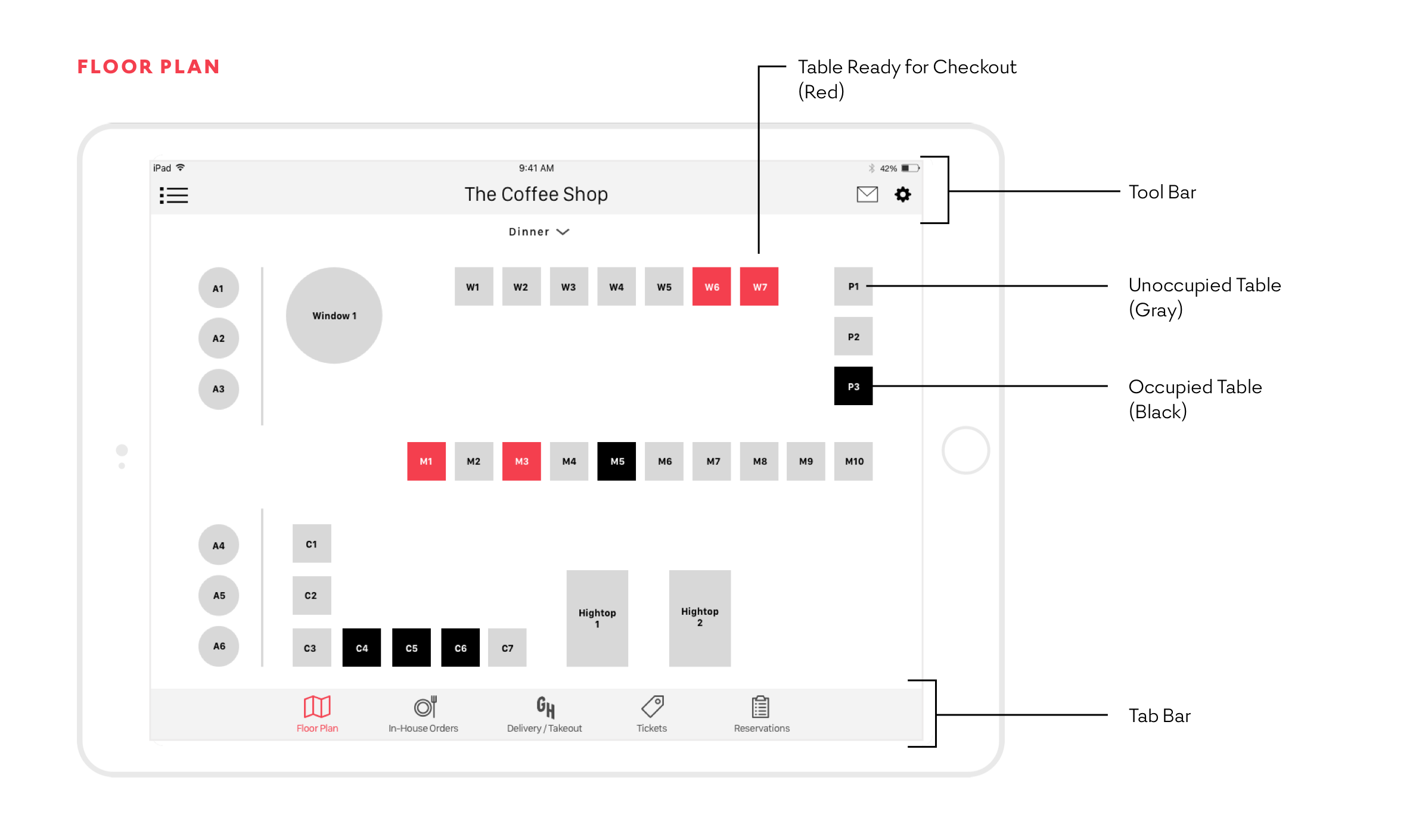
We adhered to iOS HiG standards to develop the design of this native app. From tool bars and tab bars, to the use of brand color and gestural functionality, the Grubhub POS app makes the most of the iOS design principles. Here’s a few of the specific features we modeled on the HiG guide:
Gestures: These include Tap, to press or select a control or item, such as call-to-action prompts, dropdown menus and menu selections; Horizontal Scroll, to glide through a full order on the ordering and overview screens; Touch, Hold and Drag, to select a menu item and drag it around the order or overview queue; and Swipe Left and Right, to scroll through a running list of menu categories and options on the ordering screen.
Tool bar: Consists of utilities, such as settings and mailbin.
Tab bar: Consists of navigation to five sections: Floor plan, In-house orders, Grubhub delivery and takeout, Tickets, and Analytics
Scope bars: On overview pages, our scope bars can sort orders by where in the process they are.
Fonts: For prototypes, we used the HiG-recommended San Francisco Text and Display consistently across the prototype. The app would eventually adopt Commercial Type’s font Graphik, as per Grubhub’s branding guidelines. The HiG threshold minimum font size is 12 pt, with 13 recommended. Point size in the tab bar must be 17 pt.
Button sizes: HiG requires a minimum of 44px by 44px. Our goal and ultimate solution was to design buttons larger than the minimum, somewhere near 88px, because our users would most likely be multitasking and working in low-light conditions.
developing personas
From the affinity mapping, we developed two personas — one, Gerardo, a floor manager, the other, Laura, a hostess. Both of these targeted users would directly deal with delivery, take-out and dine-in orders for our new app. Gerardo would be our primary user, as he would not only would need to know how to use every feature of the app on a daily basis, he would need to customize it for his restaurant staff’s workflows. Meanwhile, Laura would be our secondary user. She would directly interact with the Grubhub delivery and take-out feature.

From left, me, Smriti and Chris in the process of creating two of the eventual three personas that would carry us through our design.
There was a question later in the process about why a waiter would not be among our targeted users, or personas. Our argument was that a waiter would not be using the Grubhub delivery feature of the app, only the in-house feature. But just as we articulated it, we realized, “Yes, we need it.” Waiters and waitresses were going to use the system most, and not only that, they were going to use, if not the Grubhub delivery feature, every other feature of the app.
We got back to work, going back to our notes and quickly synthesizing a new target user from our research and interviews.
Our waitress, Natalie, would be our tertiary (and final) persona.
Ideation & Sketching
Through the stories of our personas, we started the process of ideating features for the app — first on a whiteboard, then through individual sketches, then in wireframes, with each successive stage refining the details, bringing more focus to each feature. From the wireframes in Sketch, we would built the first iteration of the app in InVision.

Smriti, left, and Chris sketch out design ideas for the new app. Below, all my sketches for the app.


A medium-fidelity sketch I drew of the new app.
Over the weekend, we would split up to sketch, wireframe and prototype our designs. On Saturday, I sketched out designs of the app in marker, then proceeded to do medium-fidelity versions of them. On Sunday, we would meet up again to go over our sketches and begin the process of editing and iterating in Sketch.
Prototyping
From our medium-fidelity sketches, we built the first iteration of our prototype in InVision. The first prototype would be mostly in black-and-white to help users testing the app to focus on the functionality and not the visual design. Each user, whether a waiter or manager, would sign into the app after a set period of time, to fulfill each transaction. Staff would also be able to clock in and clock out easily from the home screen, which is a function of Revel’s POS system.
user testing
With our first working prototype, we were ready to test it with users.
Our goal in user testing was to have the user successfully input an in-house dining order and process payments, as well as, approve and process a Grubhub takeout order.
We would present the user with an iPad, load the prototype and proceed with the test.
We would tell the user: “We are testing a prototype of a Grubhub POS system. The system will process in-house dining orders and Grubhub pickup and delivery orders. We noticed that restaurant staff often have to keep track of multiple devices when they are using a third-party delivery service. We hope this will help restaurant staff be more efficient and get orders out faster.”
A user test with a former waitress.
Before we began, we asked our users a few opening questions to get a sense of their familiarity with on-demand food delivery services and point-of-sale systems. We went to different restaurants and tested with staff. We also wanted to account for users who didn’t work at restaurants, so we created two sets of questions.
Questions for non-restaurant employees:
- Have you ever worked at a restaurant before?
- If so, what POS did you use?
- Have you used Grubhub and Seamless?
- If so, what is experience been with it so far?
Questions for current restaurant employees:
- Which POS do you use?
- What is your experience with this POS?
- How do you currently prioritize the workflow between deliveries and dine in?
We had the user login and then asked for their first impressions. We wanted to know if anything stood out to them and if our interface was comprehensible. During testing, we gave our users a scenario and a list of tasks to complete.
The scenario: “You are a floor manager at the Coffee Shop. It’s a Saturday night and very busy. You’re short on staff and you need to assist with waiting tables on top of management duties. You are currently waiting on 2 tables and processing pickup/delivery orders.”
We had the users go through a series of tasks to see if they were easy to accomplish:
- Table W1 has ordered a beer and two sandwiches, one Meatball and one Cuban. They would like their beer to come out first. Can you walk me through how you would process their order?
- You notice a notification appear on the Grubhub tab. Someone has placed an order to be picked up. You want to quickly process it so you can get back to your tables. Can you tell me how you would do this?
- You go back to the floor plan and notice that table P3 is ready to pay. They want to pay by credit card and in full and want their receipt emailed to them. Can you tell me how you would process their payment?
testing results
We had four user tests. Three out of four users were current restaurant employees. We put an iPad loaded with the prototype in front of them and, after allowing them to talk about their initial impressions, gave the user a couple of scenarios from our testing script.
From user testing, we focused on making a few changes based on these insights …
- The messaging on add-on and coursing prompts was unclear. We would add headings for each prompt as well as separate beverages and courses.
- They would like to be prompted when a Grubhub order has been unattended to for 5 minutes.
- Users, particularly managers, would like to see business insights and analytics. It’s important for managers to know how much their sales were at the end and how much to give the waiters at the end of the night.
- Users weren’t clear on what “tickets” in navigation meant. Users shouldn’t have go guess where something will lead them. We changed this to “Open Tabs.”
the app map
The final app map shows the flow of the process through the tab bar. In the final design, we removed the “Reservations” tab in favor of the “Business Insights” tab, per our user testing.
the user flow
Once we had our final persona, we developed our user flow to visualize the path of the user through the app. Our user flow is for our primary persona, the busy manager who needs to multitask between putting in an in-house order and dealing with incoming Grubhub requests. Each staffer would need to login to the POS system before they are taken to a primary landing screen — the floor plan screen. From there they would look for notifications from Grubhub, as well as be able to process in-house orders simultaneously. This is how the user would navigate through the app.
the second iteration
We worked quickly to iterate the design as a high-fidelity mockup. Based on the feedback from our user testing, some of the changes we made included …
- Bringing Grubhub brand color and messaging into the tool bar, prompts, feedback and into the call-to-action buttons.
- We improved the add-on pop-ups to be more intuitive through language and color.
- We added a prompt to notify users when a Grubhub order has waited too long before being fired.
- Simplified icons in the tool bar further.
- Making icon messaging more intuitive: “Tickets” becomes “Open Tabs.”
- “Reservations” was removed in favor of having accessibility to “Business Analytics” in the tab bar.
- We added more feedback during credit card processing.
next steps
In the immediate future, we recommended …
- Continue Testing and Contextual Inquiry: Understand how we can improve our current product while also understanding the general needs of restaurants to continue adding features needed to fully run their business solely on Grubhub POS system.
- Finishing up Hamburger Menu and Settings Menu: Understand full scope of what menu options to include and how to provide restaurant proprietors the information needed for daily tasks and high level view to run their business.
- Changing the contrast of negative space within the app, including on the floor plan.
In the longer-term, we recommended …
- Build Back of House (BOH) Interface System: Bring BOH functionality into the kitchen, so that actions taken by line cooks reflects in real time for FOH team.
- Reservation System: Investigate API system that would allow Opentable to have a login integration with Grubhub POS.
- Customizable Floor Plan: Build feature to allow restaurant to customize restaurant floor plan.
Granular changes we recommended …
- Marketing and Branding: Review microcopy and ensure all branding is appropriate for release.
- Portrait View of iPad POS Interface: Understand how we can improve our current product while also understanding the general needs of restaurants to continue adding features needed to fully run their business solely on Grubhub POS system.
Conceptual changes we recommended …
- Having Menus Automatically Load by Time of Day: Build feature to have restaurants have different pricing for time of day.
- Add-on Approvals: Iron out inefficiencies with sending “add-on” approval pricing to Grubhub. Possibly create an in-app process to have company remotely approve charges.
- Sales Reporting by User: Sales reports by waiter and waitress reports with a potential API through Salesforce.
- Table Wait Time Calculator: Wait time calculator would be able to estimate wait times for customers.
- Apple Watches for Wait Staff: To allow for real time notification for waitstaff to know when a meal has been prepared and ready for serving.
- Setting Up API with Restaurants That Have Their Own Ordering System: Allow restaurants that allow customers that order directly though the restaurant website, integration opportunity so that all orders funnel through Grubhub POS system.
- Business Development Opportunities Calling API’s with Different Vendors: Business opportunity to allow different vendors like DoorDash, Postmates and Eat24 to integrate with Grubhub POS so all systems go through one terminal.
what i learned
I learned that, as a user experience designer, you can’t solve every problem in one project. It’s counterproductive. Exponentially, your project shouldn’t, nor can it, solve everyone’s problems. It can be easy to lose focus when there are so many problems to solve, but it’s important to solve the ones you can that are most essential with the resources at your disposal.
As far as mistakes: We added “Business Analytics” to the tab bar for our final mockup. We can validate why we added it, but one thing I learned through this project, is that you don’t have to act on every insight from user research or user testing. In further iterations of the app, I would add “Reservations” back to the global navigation, and place “Business Analytics” under a dropdown in the tool bar.
Finally, having read the HiG manual, I learned the guidelines in designing for iOS. It was an invaluable resource in helping us ideate, sketch, wireframe and prototype our design for iPad. I know I will return again and again to the HiG as iOS evolves into the future.